Brief
Design a better experience for people who were booking, attending, and reflecting on training courses.
My Contributions
- Research & Discover
- Ideation
- Information Architecture
- Product Design
- Visual Design
- Interaction Design
- Front End Development
Project Team
- Michael Wood User Experience
- Barry Product Management
- Mark Back End Development
- Beth Testing
- Andy Development Manager
Process Overview
- Research
- Analysis
- Wireframing
- Prototyping
- Front End Development
- Back End Development
- User Testing
- Revision
- Final
Research & Discover
Given that the project was an improvement on a current system, interviews with people who had used that system were important. The business knew it had a problem with the online experience from feedback it had had, and my job was to take those nebulous ideas and make them into something clearer.
Group Workshops with people who were new to training courses were very important, as were the feedback sessions with people who been on courses and were keen to reflect on their experiences. Often those workshops were able to bleed into design sessions where people drew out interfaces, allowing them to set a priority on what they wanted.
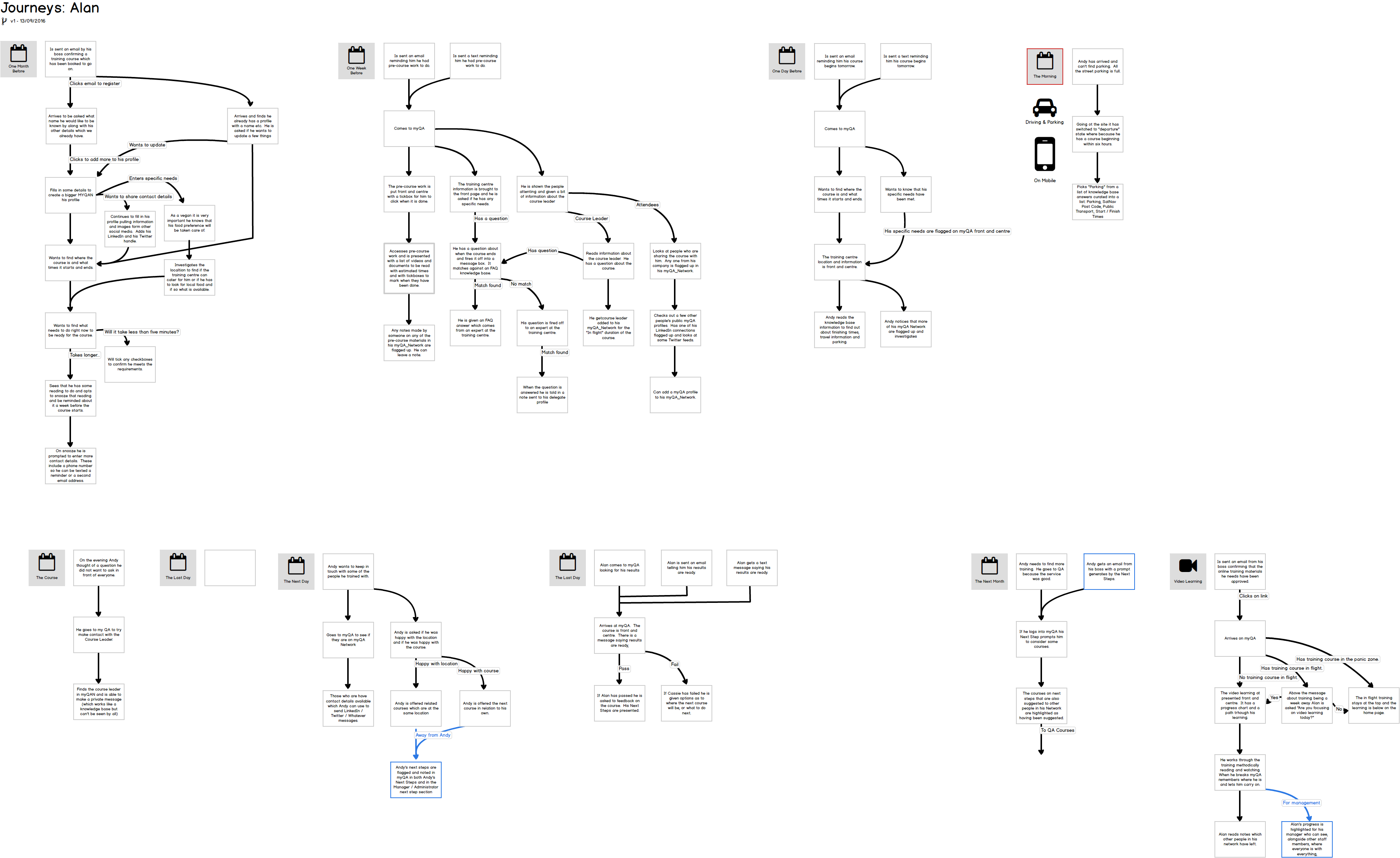
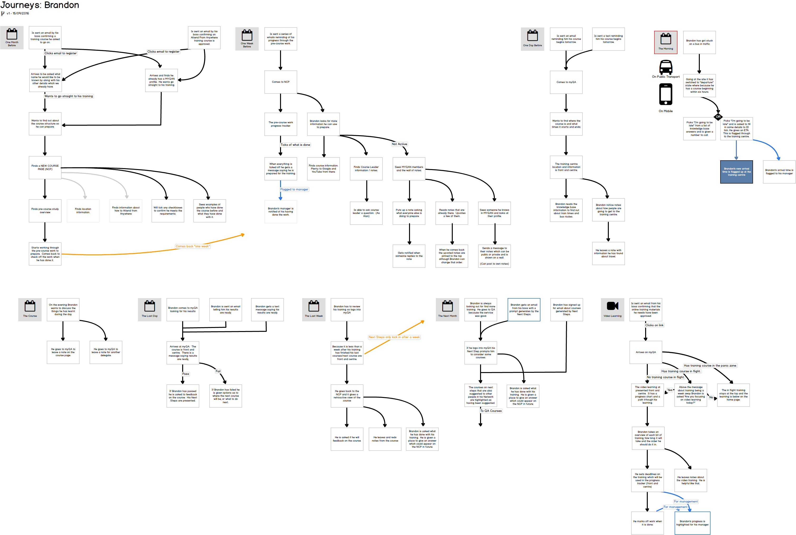
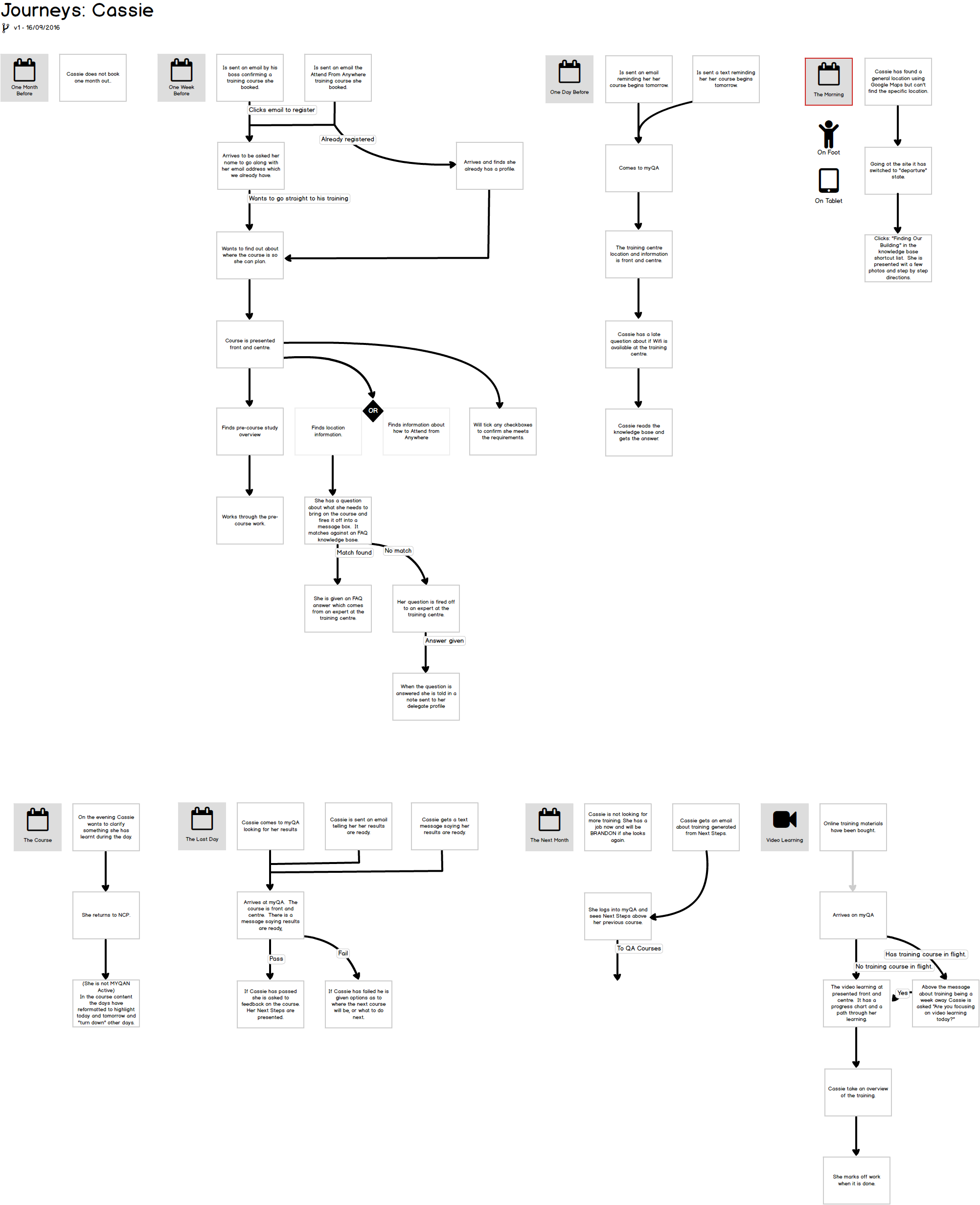
The ideas from these workshops were run into a wireframing of interfaces which allowed me to compare the current system with proposals, generate ideas for changes, to identify areas where we could improve the system.
I was also able to aggregate the use data from the current system and identify the pain points in the current system, as well as the error logs and complaints generated by that system, to find areas of improvement.
Key Insights
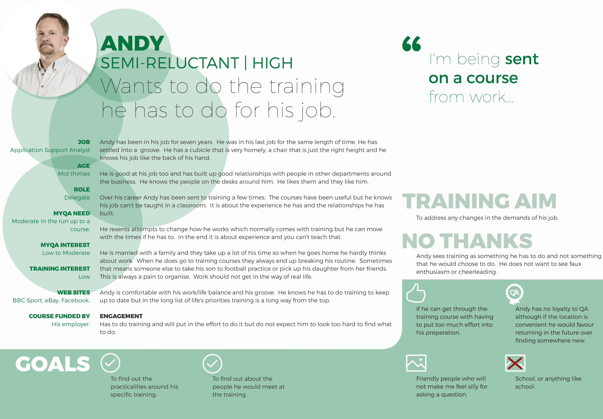
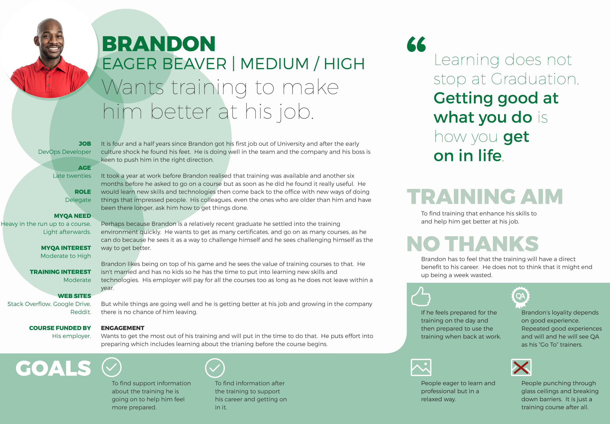
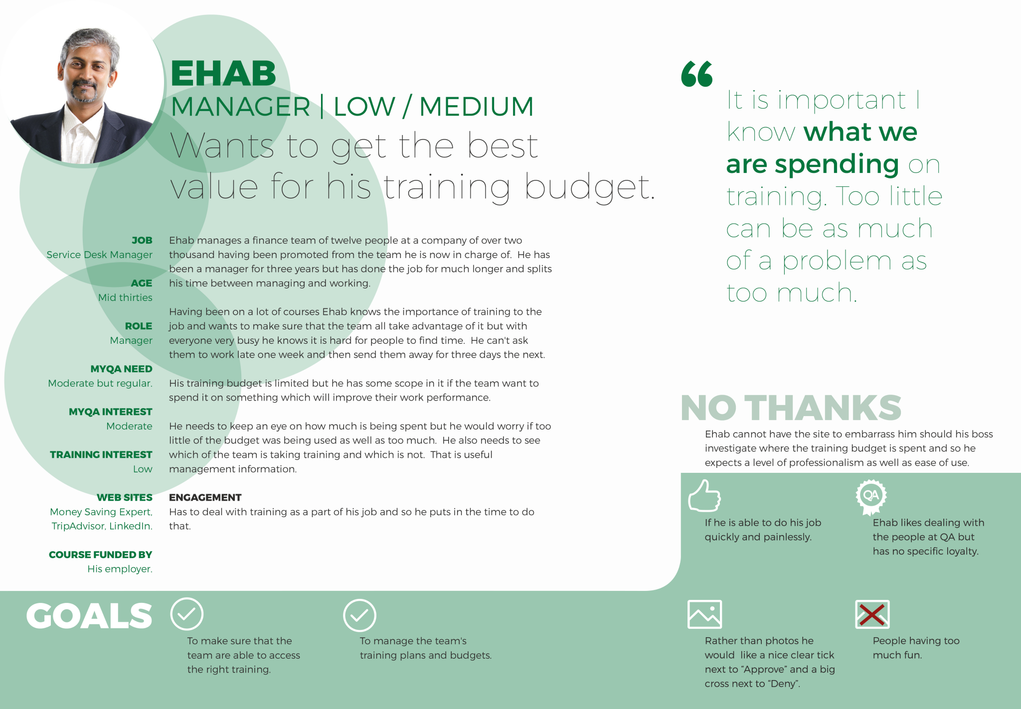
That most people who were going on training courses found either too little information, or too much, depending on their level of interest. If they were being "sent on a course" they had simple questions which needed answering, and we presented them with things they were not interested in, if they were interested in the subject our information was difficult to navigate and too brief.
That all customers were not very well served on the day of the course when they wanted specific information about location, check in, and what to do if they are running late.
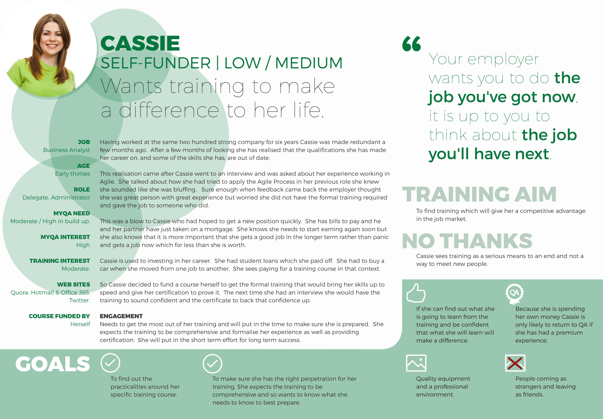
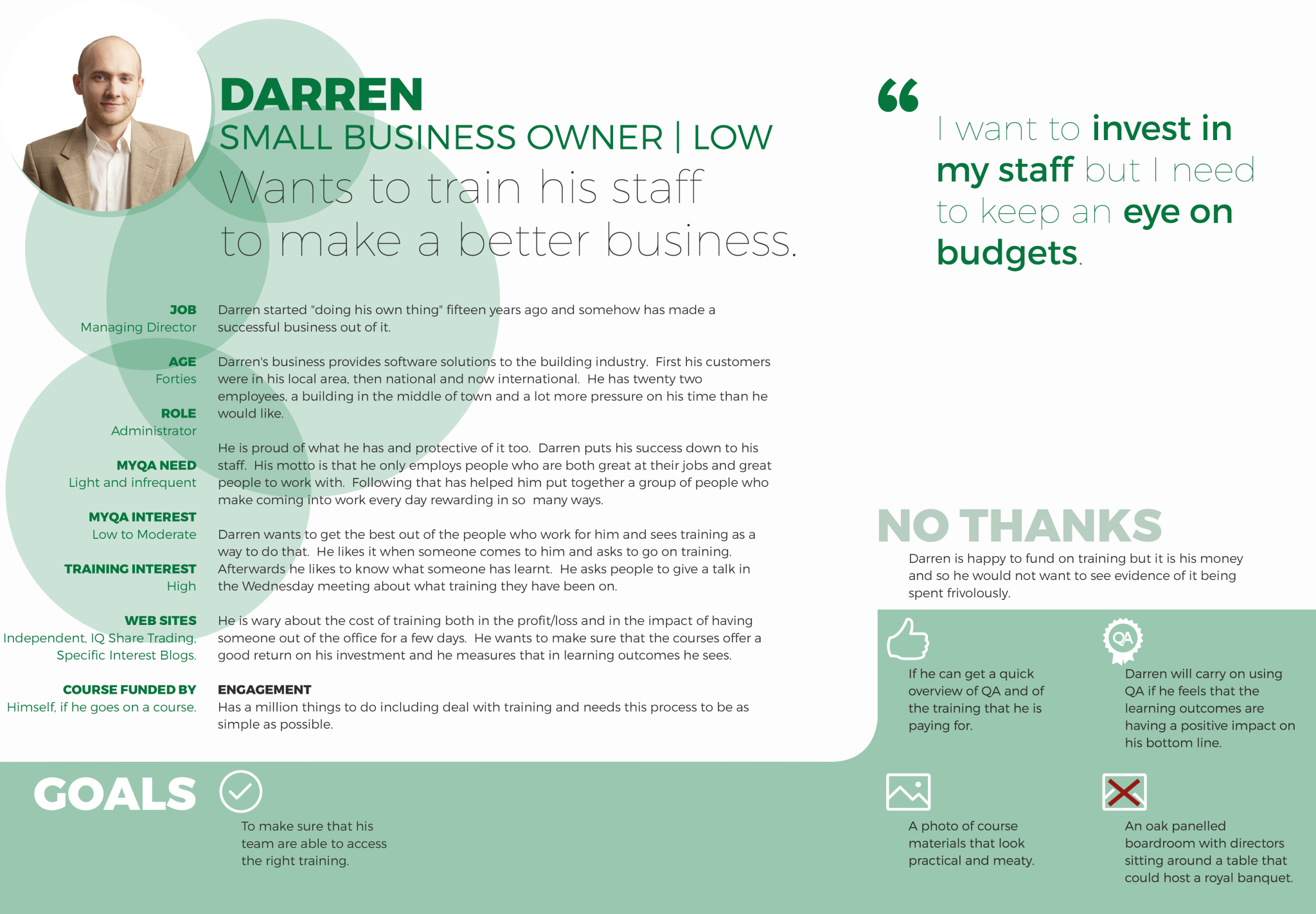
That people who were paying for the courses found it difficult to get reporting on attendance and engagement.
That people who paid for the course themselves wanted to feel they were getting access to support information.
Problem Statement
Delegates who used our website found an inappropriate amount of information presented to them. While most information Delegates needed was on our website, it was presented without a hierarchy, and with an inaccessible structure. This is a problem because Delegate's positive interactions are significant factors in high satisfaction and rebooking.
Ideation Phase
- Extensive interviewing with people and colleagues.
- Data crunch analysis of the journeys people were using the website for, and the problems they were having.
- Journey mapping to create an information architecture that supported people's training course support needs.
- State mapping for people in different stages of their experience with training courses.
- Workshops with different groups of people to rapidly prototype wireframe, and prioritising journey mapping.
- Personas to better facilitate user-centric thinking in the team.
- Wireframing with interactive feedback loops, prototyping in a real world environment.
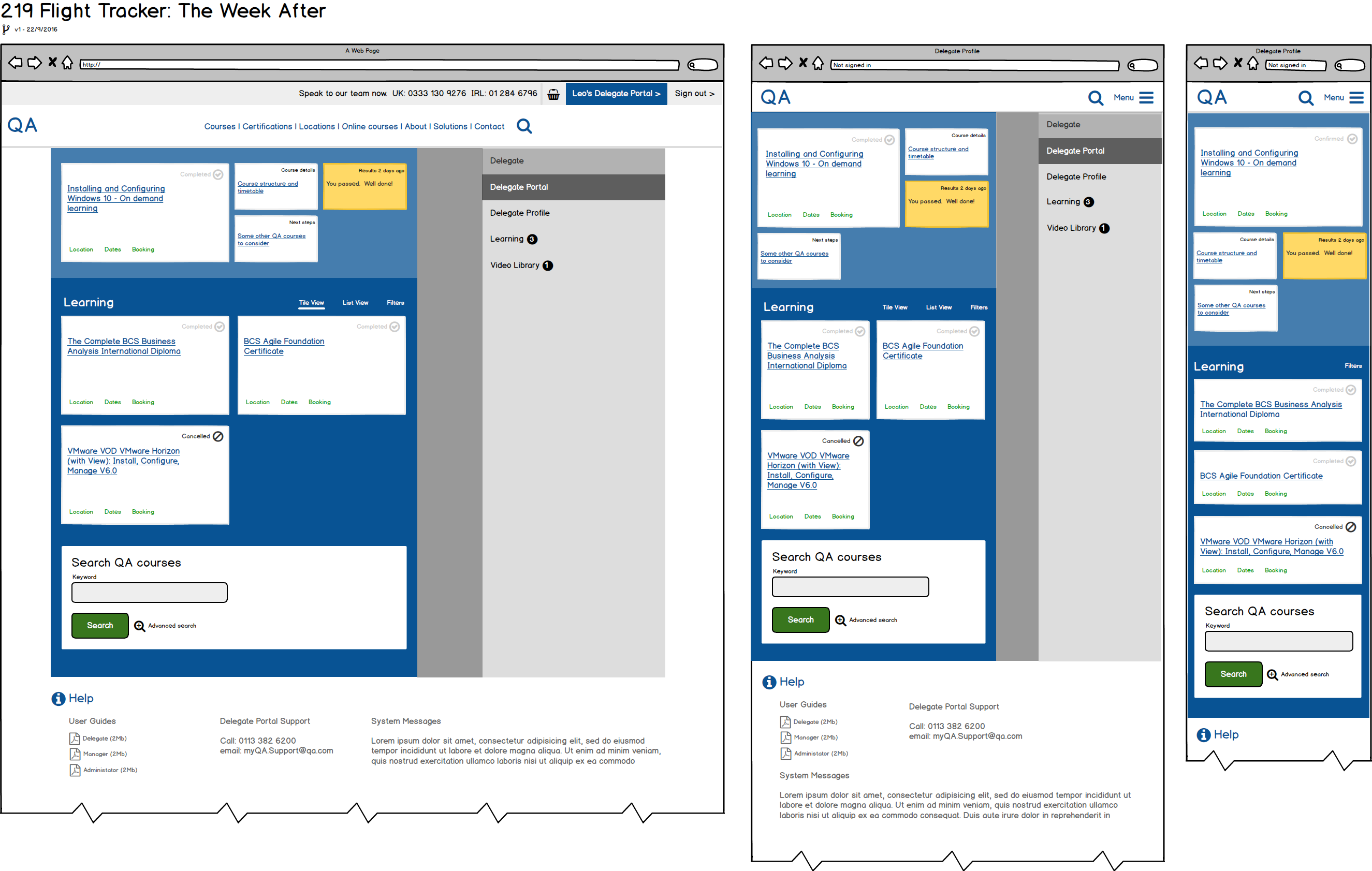
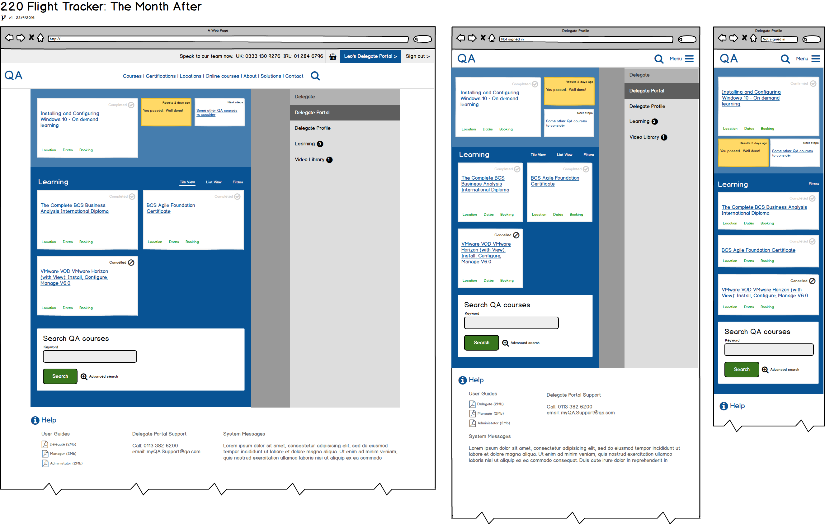
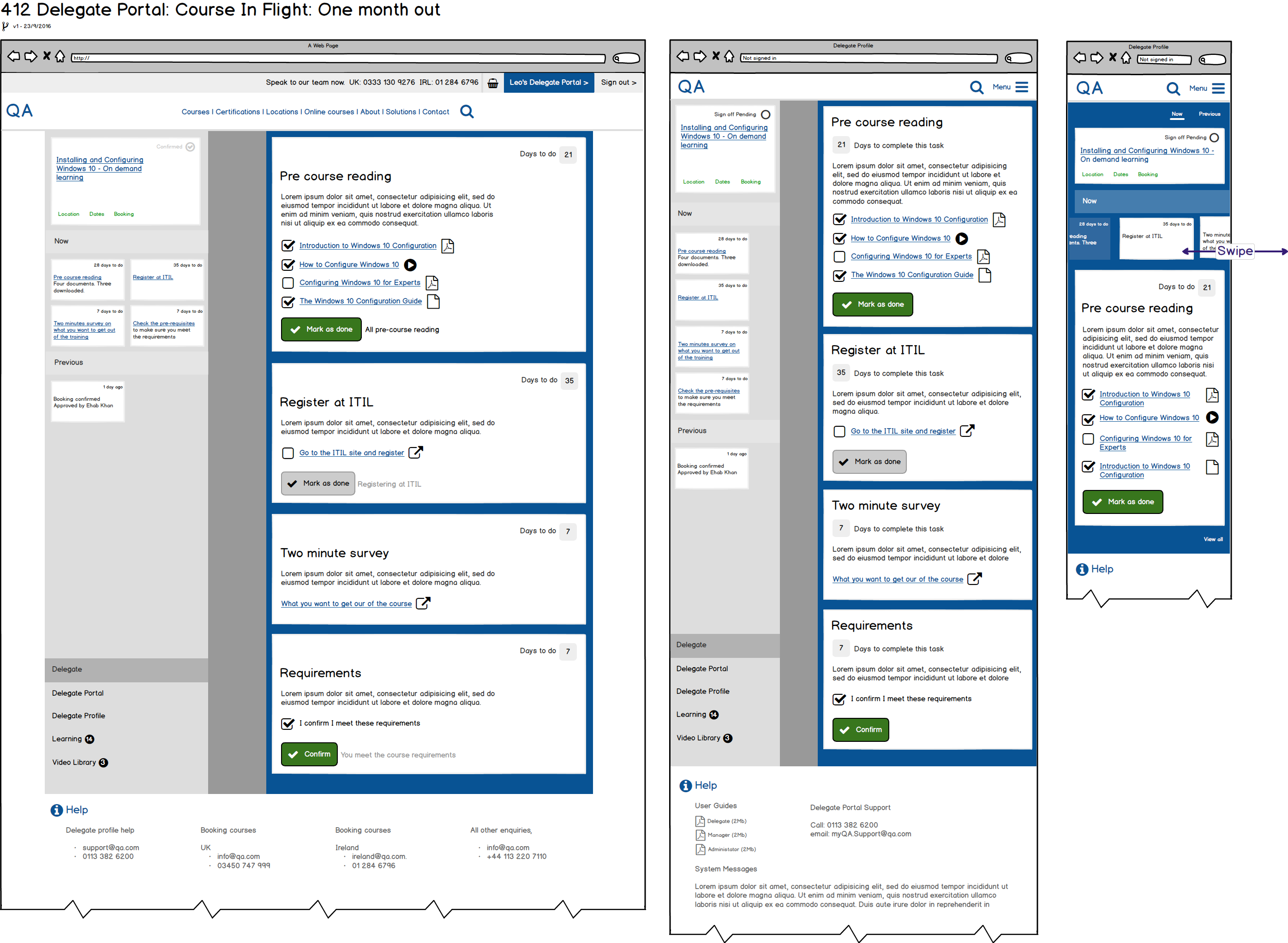
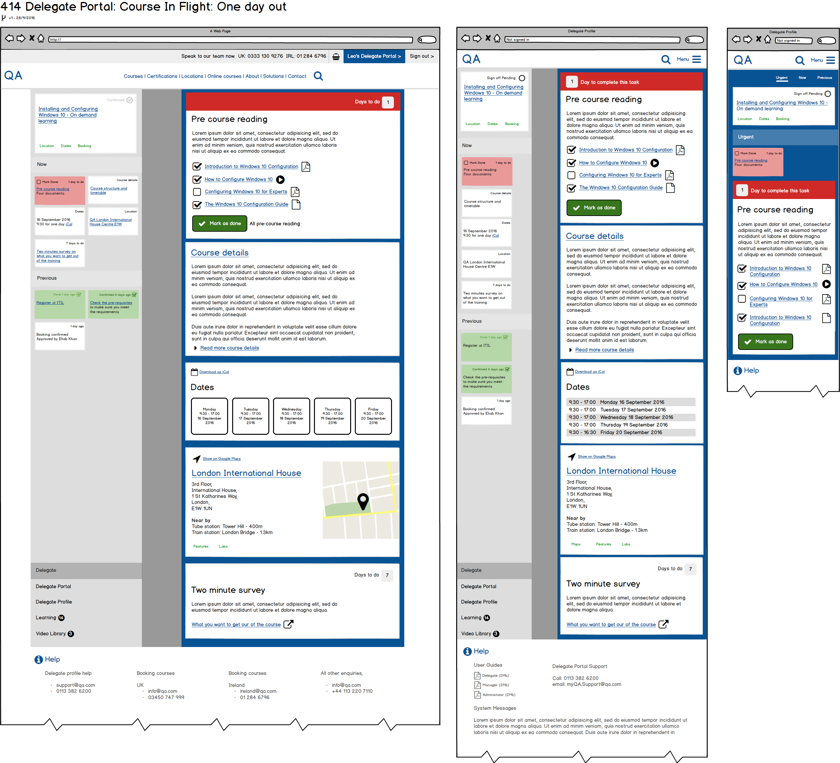
The Concept
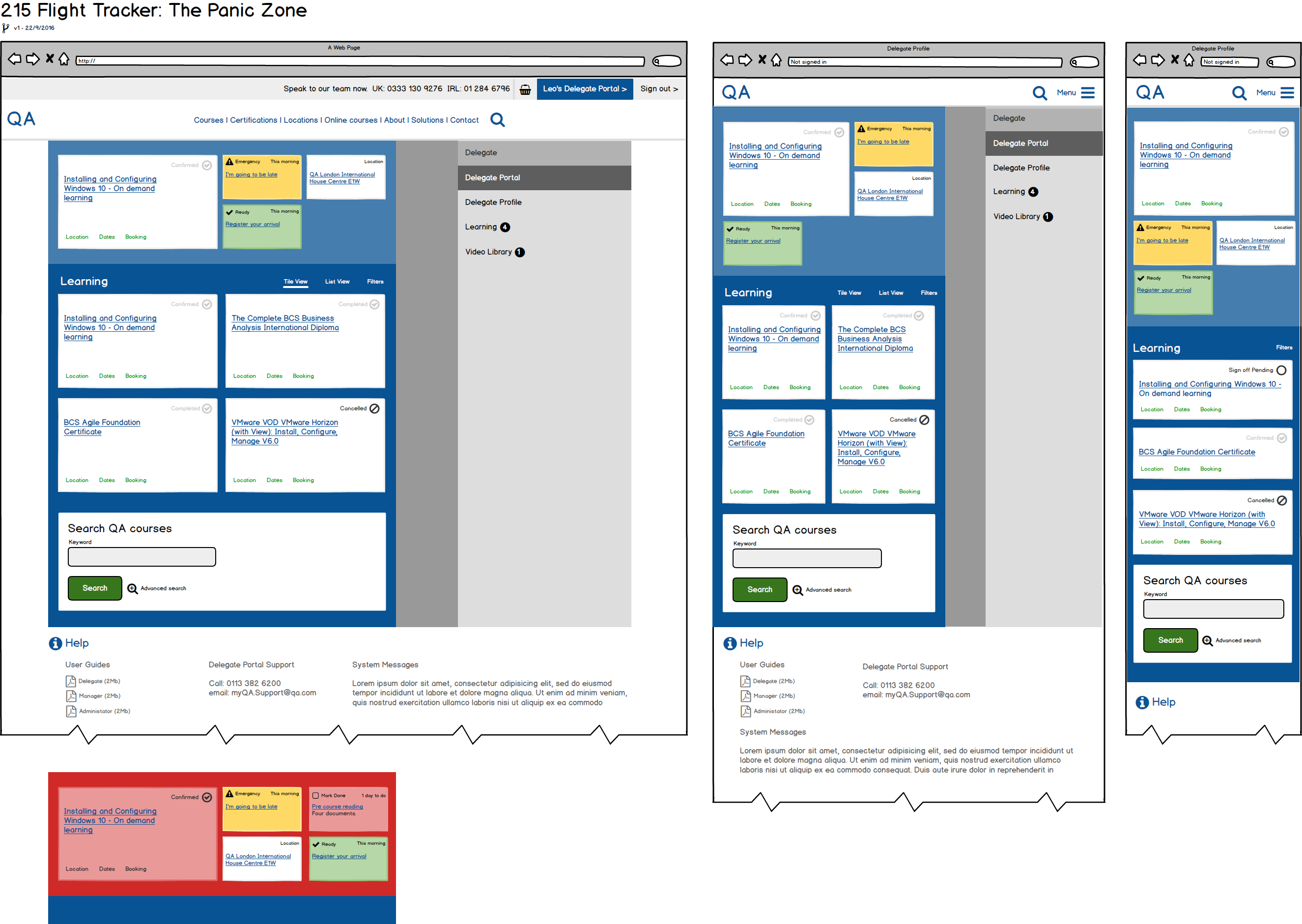
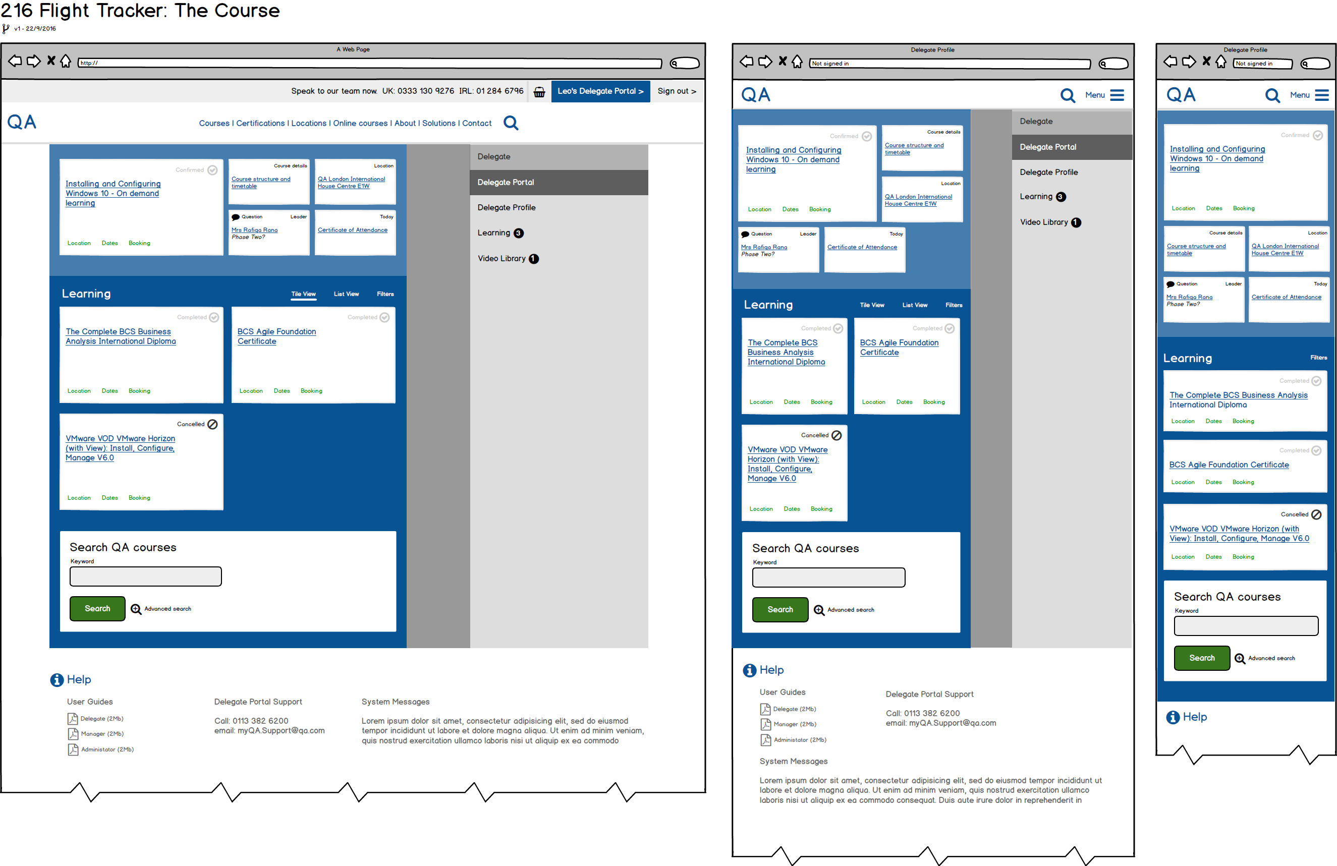
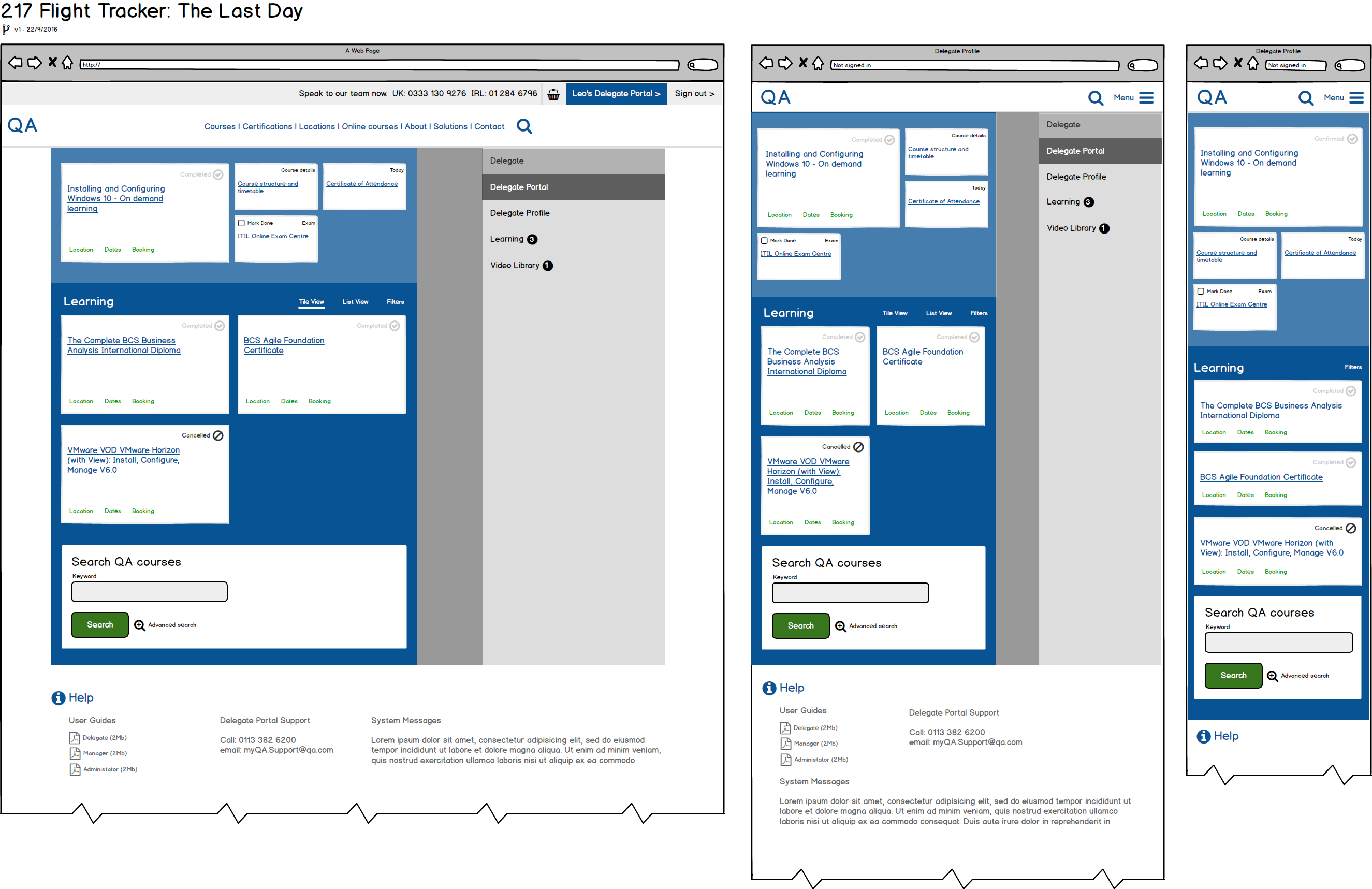
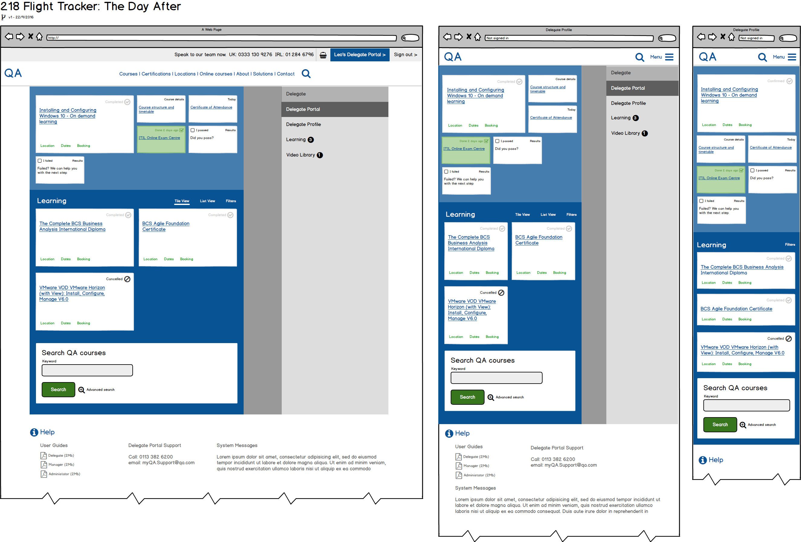
An experience which does for going on a course what great travel apps do for getting on a plane, giving customers the information they need, when they need it.
Personas
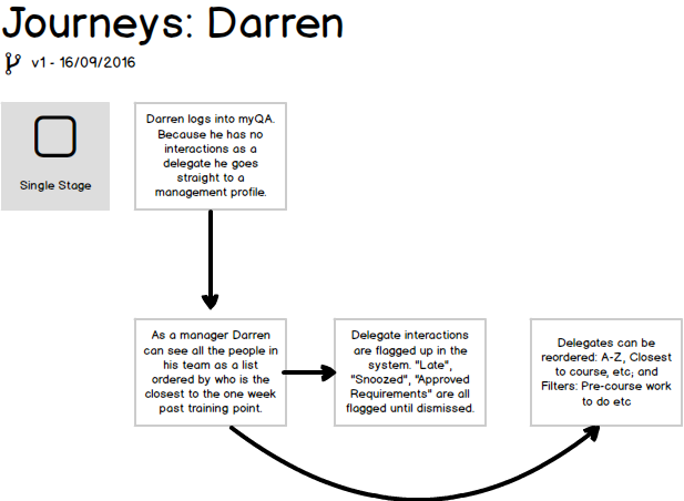
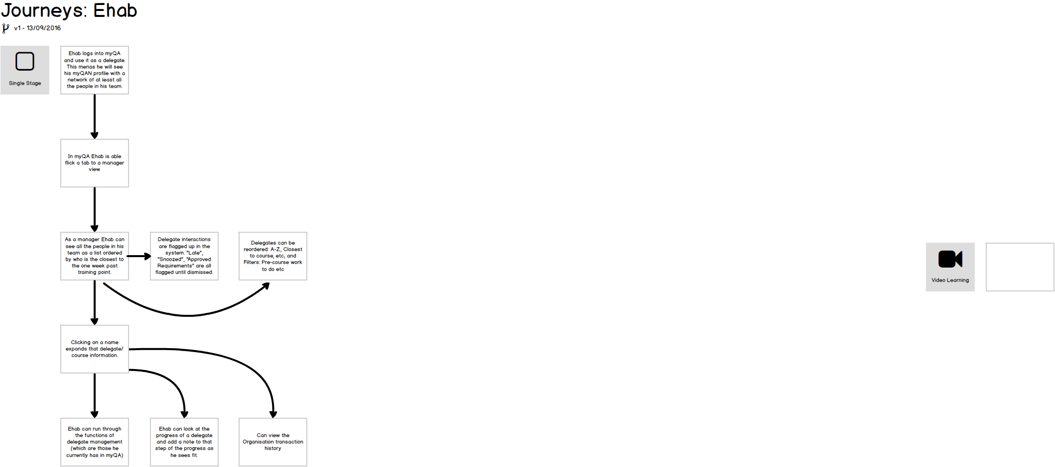
Journey Mapping
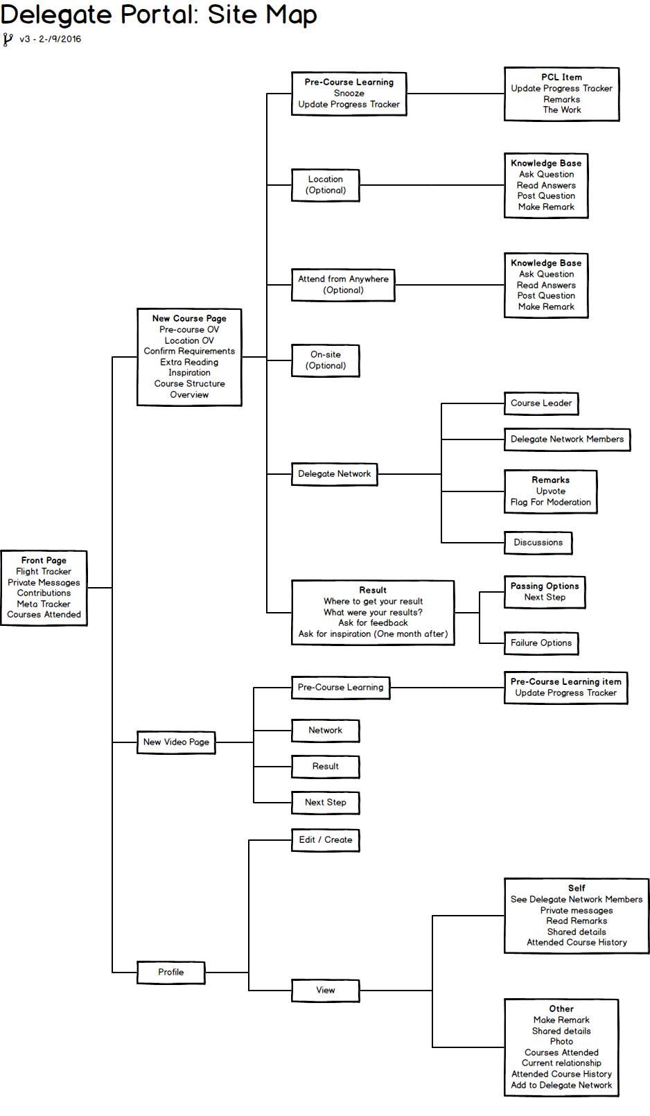
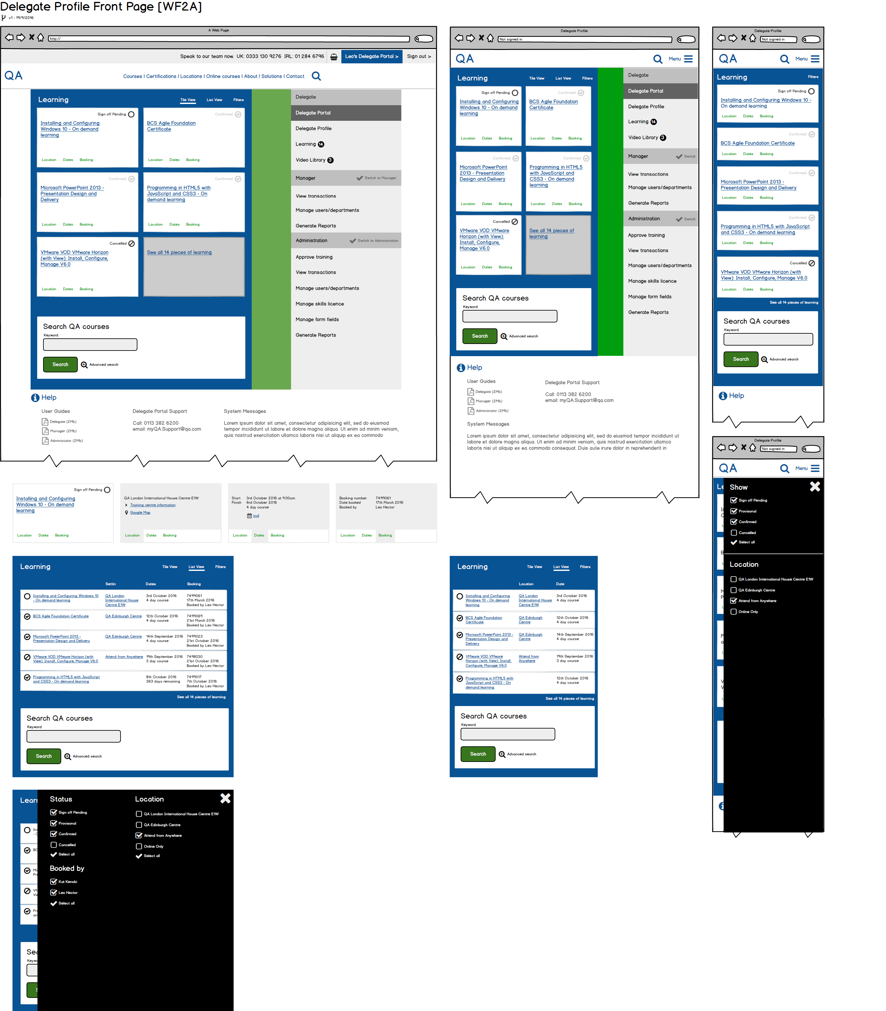
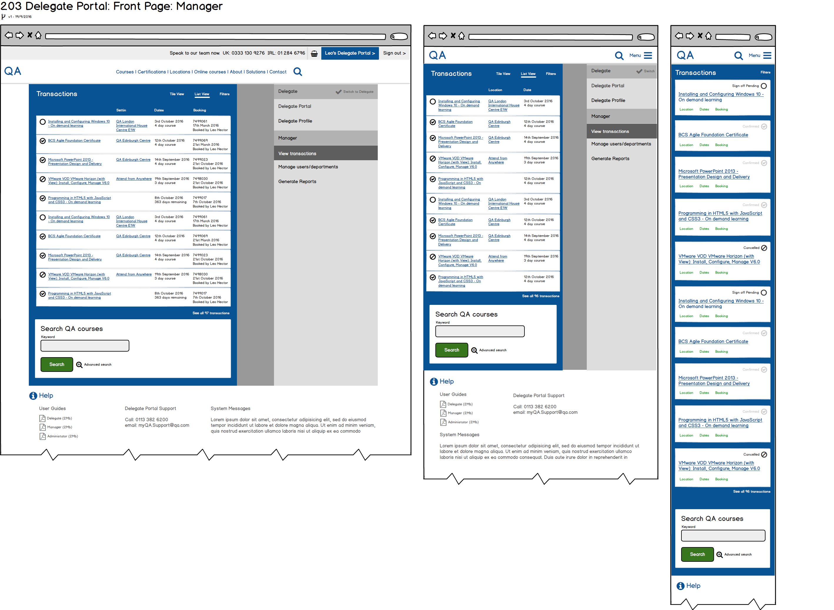
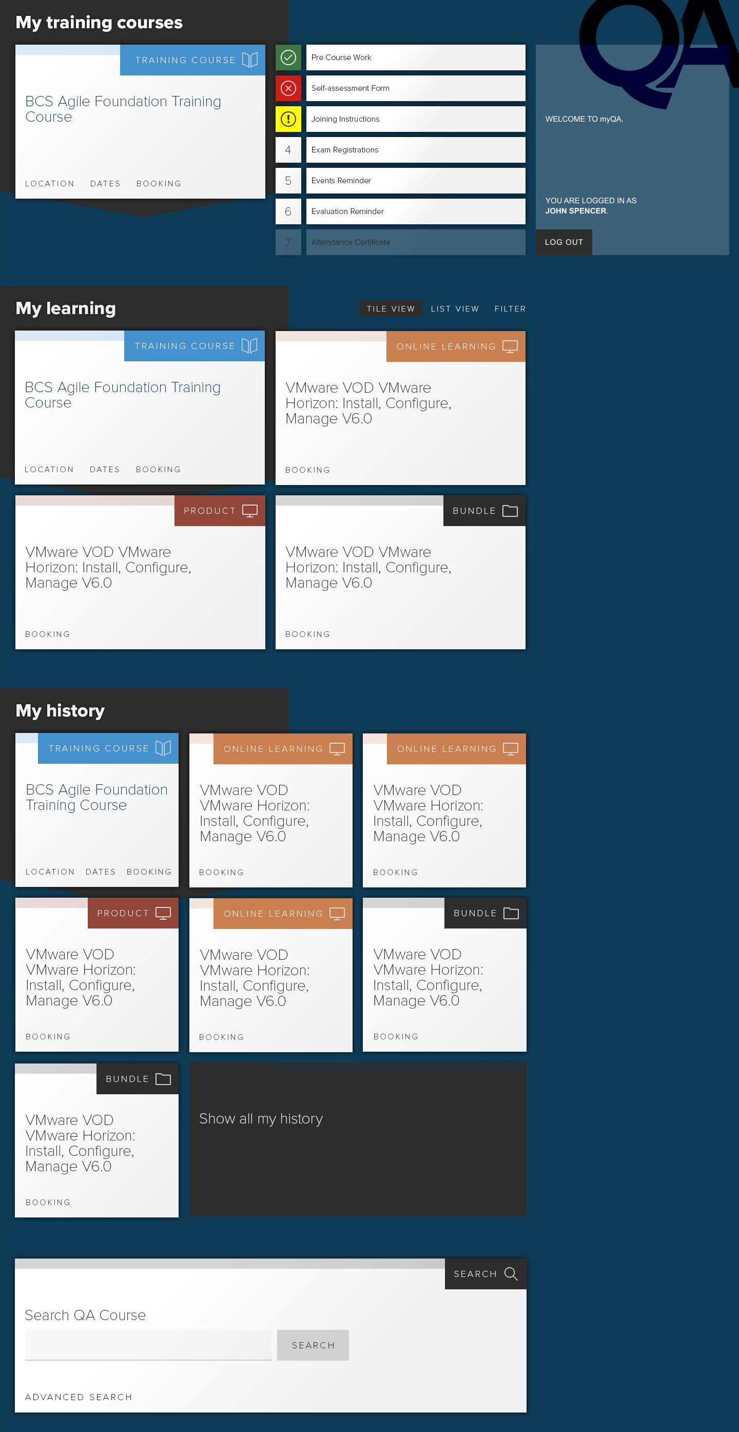
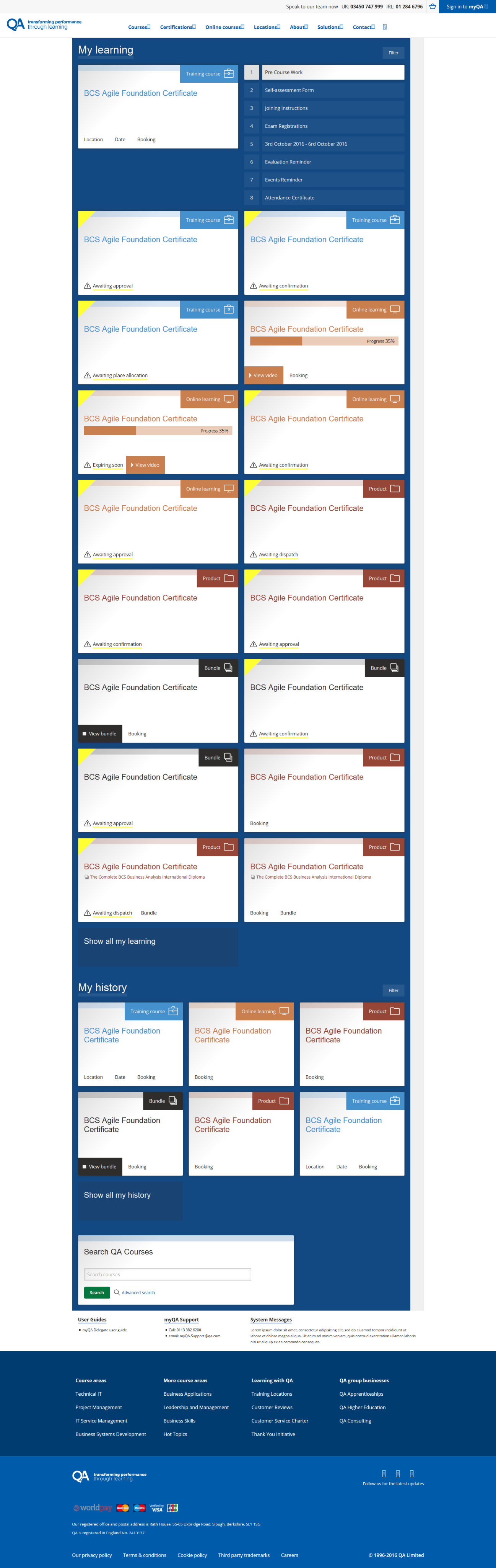
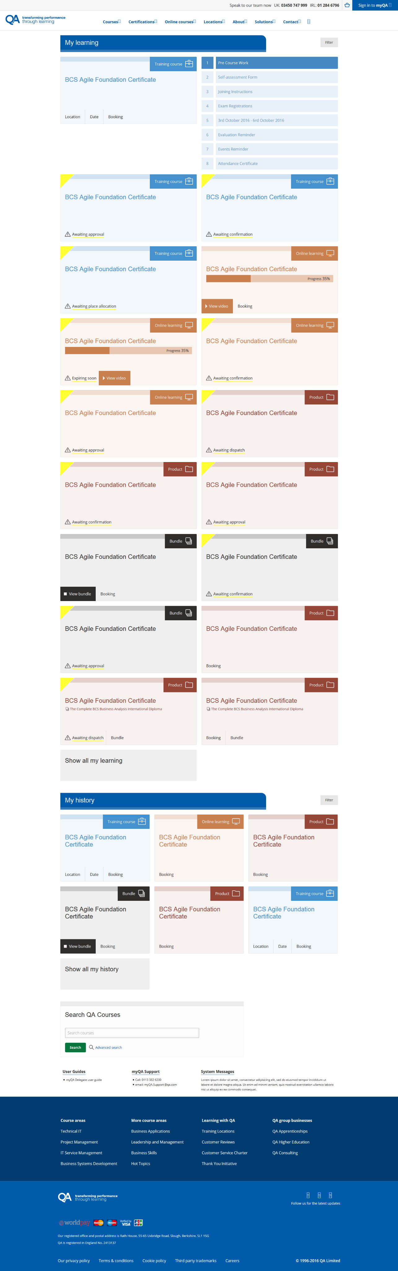
Wireframes
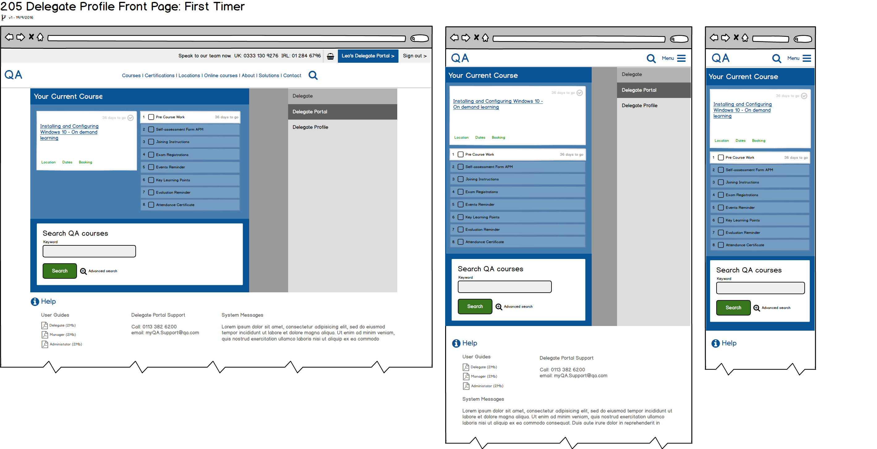
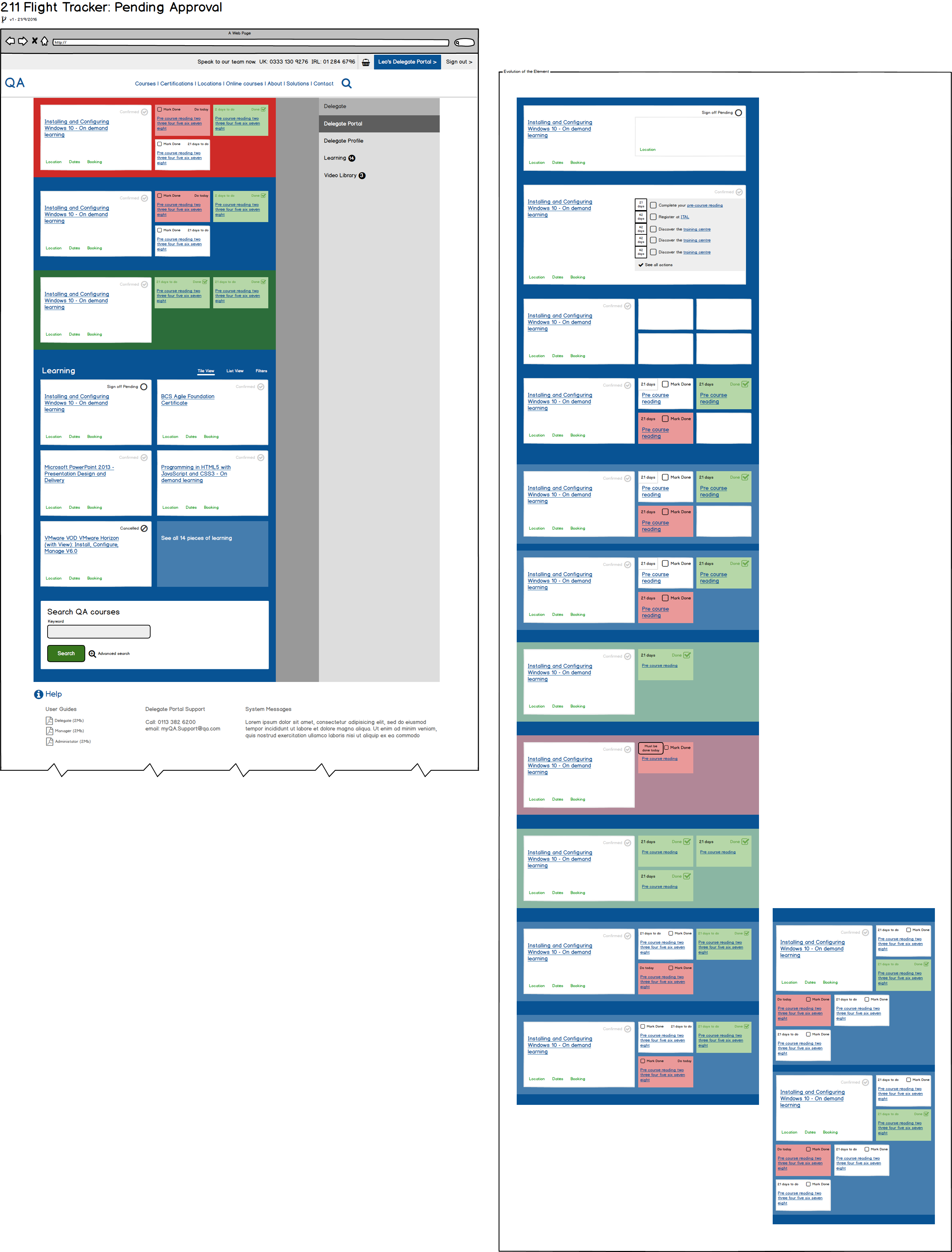
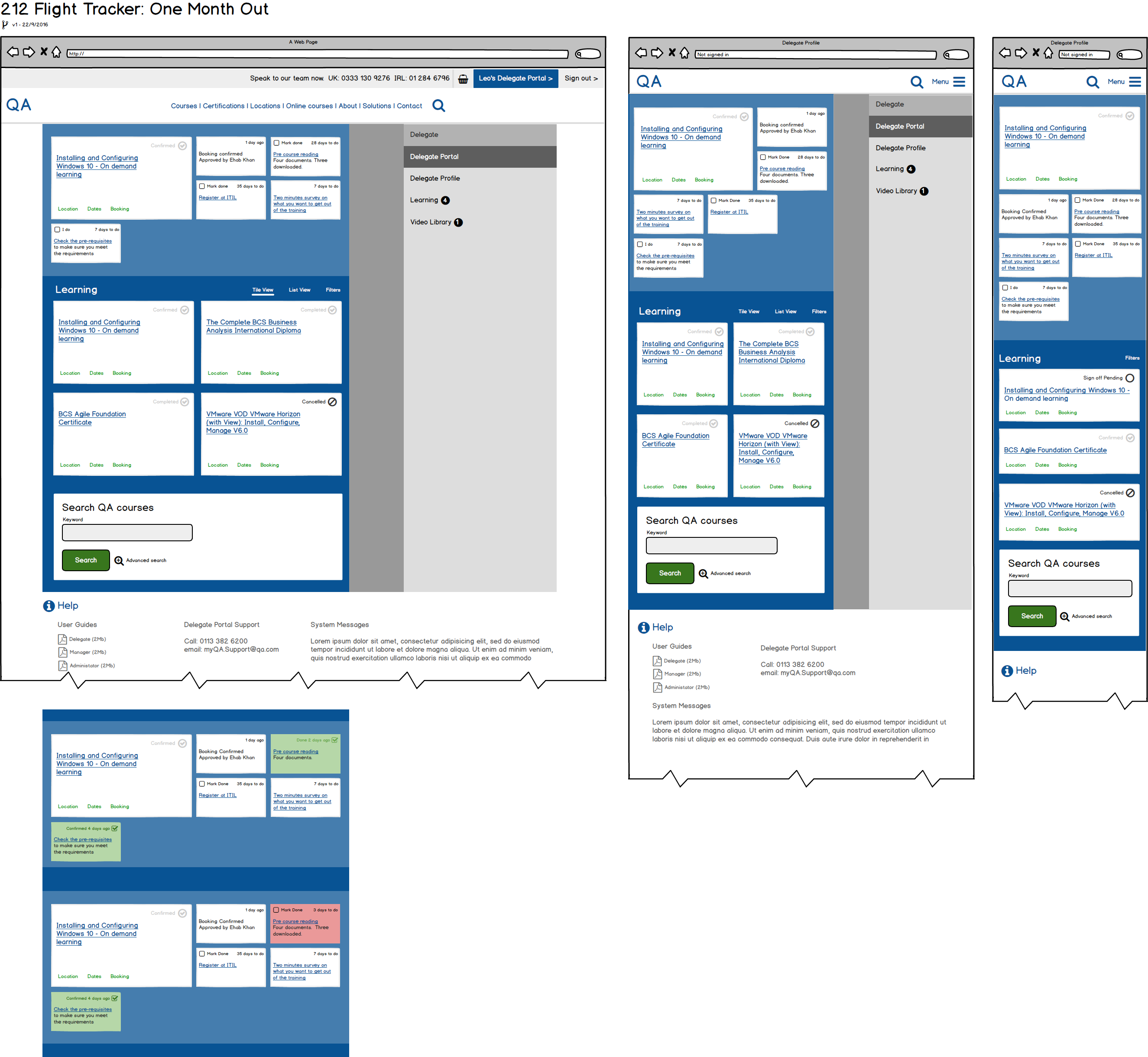
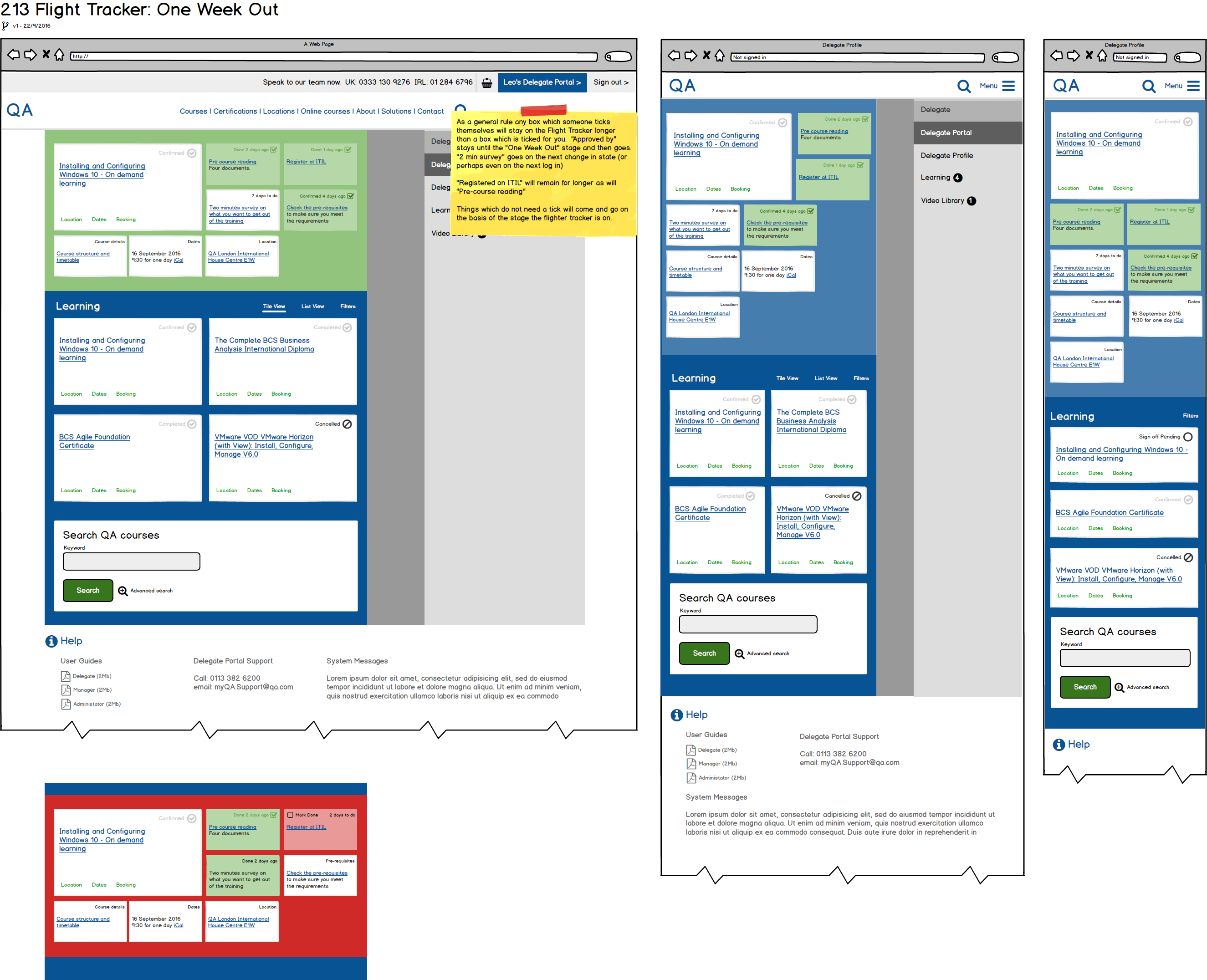
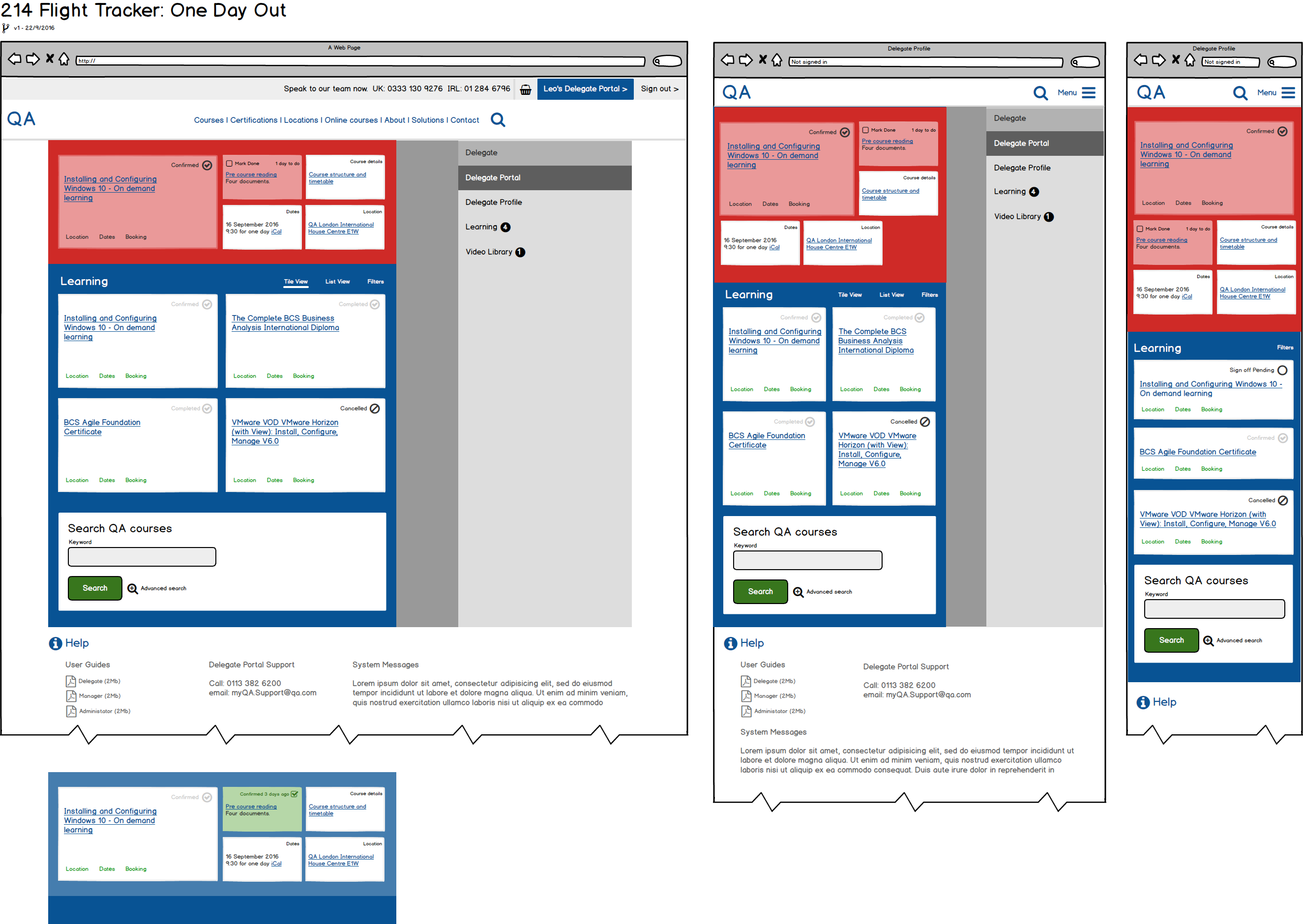
More Wireframes
Prototype
- Prototype Clickable Prototype to guide stakeholders though the process.
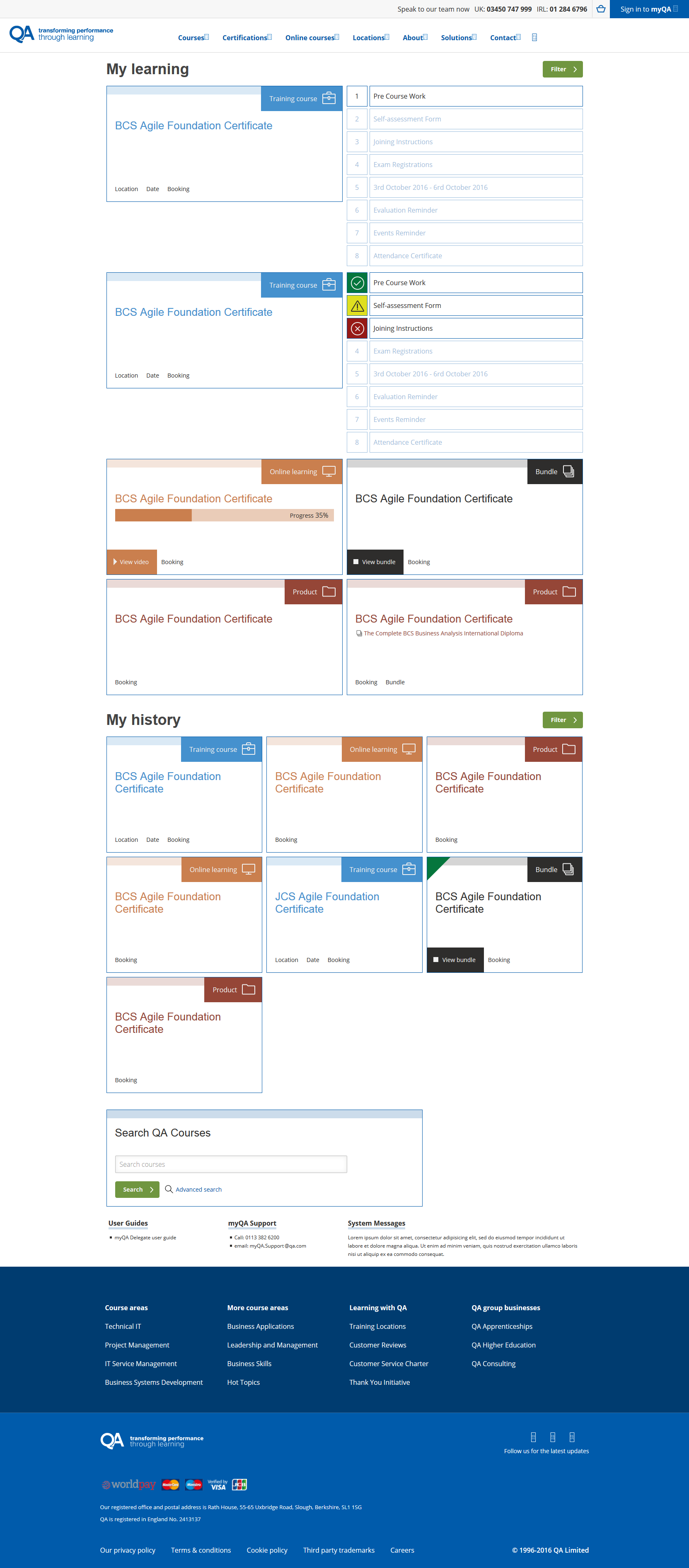
Visual Designs
User Testing
Looked at data around usage and included research surveys which were sent to users at different times about what they had seen, and what they expected to see.
Features
- New interface built around the metaphor of Travel Departures, to be time-sensitive.
- Better store of information for people who have been on courses.
Outcome
"It does not give you the course text when you are looking for the post code, but doesn't give you the post code a month later when you need to see the course text" - Steven Williams, Delegate and Interview subject.
A new website which was sensitive to people's position in their journey, which increased customer recommendation rates in the longer term by (estimated) 16%.
Final Thoughts
The right metaphor, when used correctly, can push new users up a steep learning curve very effectively.