
Designing Interfaces
Creating a great web interface starts with talking to people about the journeys they take, and the information they need to do what they want to do, and then finding a way to present that which does not make people's heads explode by putting everything on one page.
Which is to say, a great web interface understands the cognitive load which comes from seeing a lot of information and no idea of how to get through it. When talking to people about what they hate when using interfaces, they talk about this.
Over the last fifteen years I have made a lot of interfaces with a lot of good people, and I have four main principles on how great interfaces should work.
Principle One:
Low Cognitive Load
People struggle when a screen contains too much competing information or when content appears unrelated or unfocused. Reducing cognitive load means presenting only what matters at that moment and grouping related information so it has context and purpose.
When people can focus on one thing at a time, they feel confident - not overwhelmed.
An Example
DD Track+ was designed with cognitive load in mind. In earlier systems, users struggled because screens contained too much competing information, making it difficult to know what to do next. DD Track+ solves this by showing only what matters at each stage of the workflow.
People see the task they need to act on. By reducing noise and prioritising clarity, DD Track+ helps people stay focused, navigate with confidence, and complete work faster - without feeling overwhelmed.
Results The design below cut around thirty seconds out of the typical user's first five minutes on the site, producing “a feeling of instant effectiveness.”
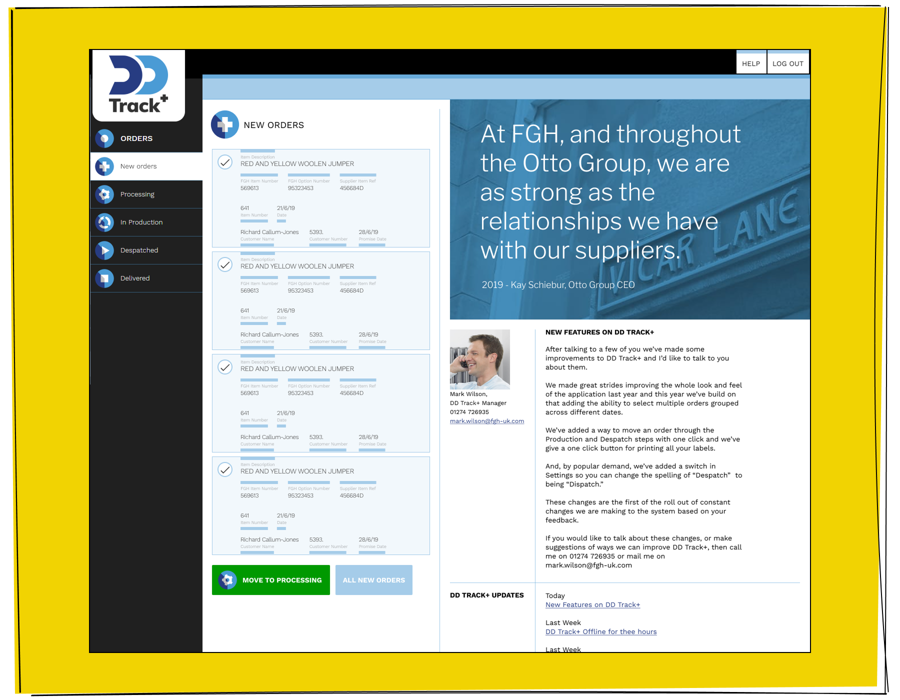
The DD Track+ interface must present important corporate information in a clear and structured way, while still allowing users to instantly access New Orders at any moment. It needs to balance the weight of high-level organisational data with the urgency and convenience of jumping straight into active work.
Principle Two:
Progressive Disclosure
Instead of showing everything upfront, interfaces should reveal more detail as people need it. A good design provides a clear starting point, then allows users to dig deeper by expanding sections, opening panels, or navigating through steps.
People don't need all information immediately - just the next piece.
An Example
Lexxic follows a progressive disclosure approach to reduce overwhelm and guide users with clarity. Instead of showing every option or piece of content upfront, Lexxic presents a simple, intuitive starting point: people see an element to investigate further.
Additional detail only appears when the person chooses to explore further - by expanding a section, opening a row, and stepping deeper into the workflow. This structure keeps the interface focused and calm, while still making rich information available at the moment it becomes relevant. By revealing complexity only when needed, Lexxic allows people to stay in control of their journey and prevents them from feeling overloaded.
Results The functionality below allowed users to remain on a single screen when confirming more data, leading to a drop in bad submissions of around a quarter. “It is easier to make sure you have the row you need.”.
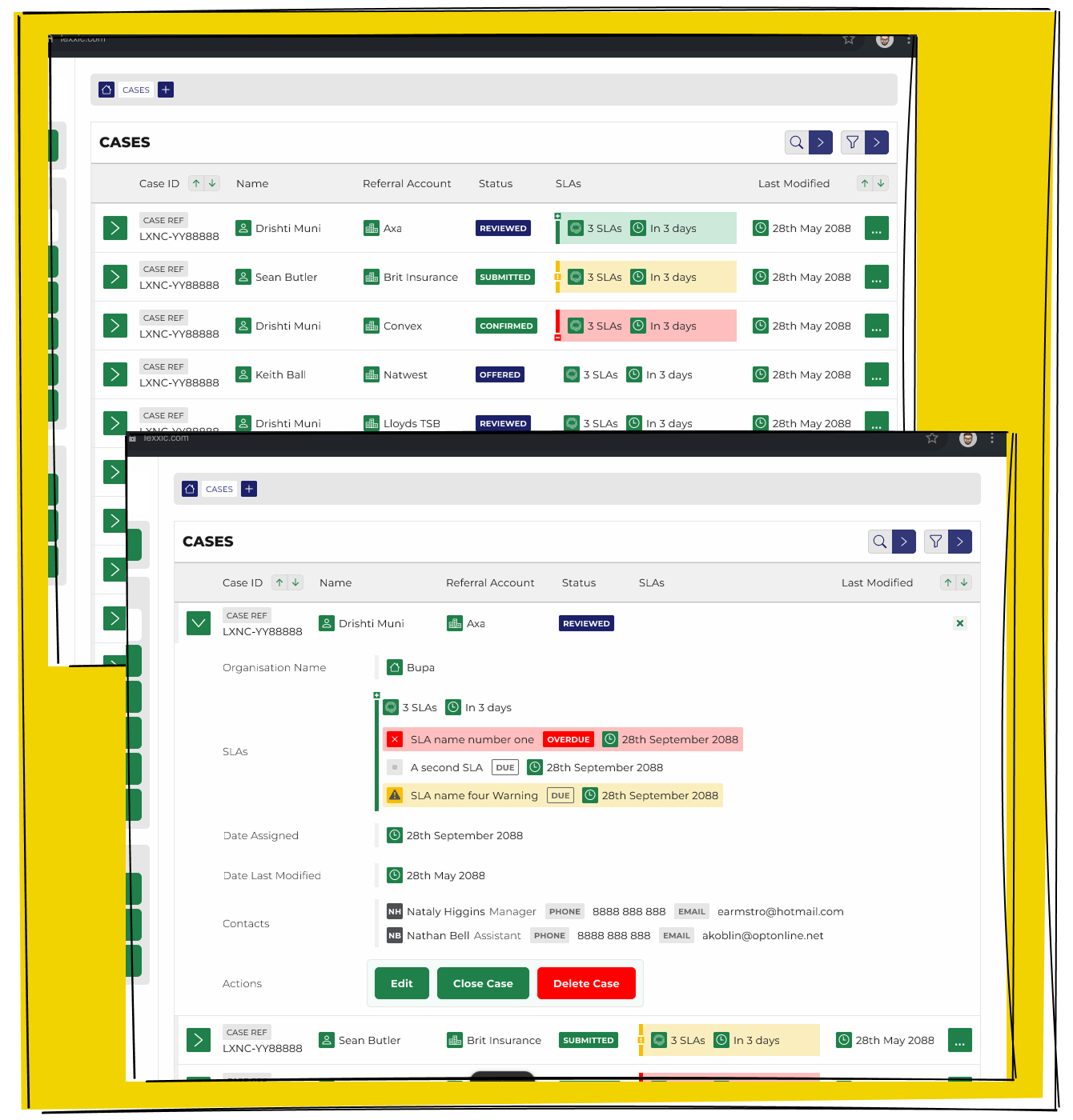
Expanding a row within the Lexxic interface allows users to drill down into the information they need. This simple interaction reveals additional detail without overwhelming the screen, giving people control over how much they see and when.
Principle Three:
Clear and Direct
Interfaces should communicate clearly through labels, language, and iconography, making actions obvious. Buttons, menu items, and links should lead users toward their goal, not just to another page.
People don't mind doing the work if they understand what each action will achieve.
An Example
QA Arrivals demonstrates clarity by making every action, button, and label unmistakably purposeful. Instead of forcing users to guess what a control might do, QA uses precise language and intuitive iconography to guide people through the process.
Each button leads to progression - not just another screen - helping users move closer to their goal with every interaction. By keeping its communication direct and its interface self-explanatory, QA Arrivals reduces hesitation and keeps users focused on completing their tasks.
Results Speeding up the QA Arrivals Project was a whole thing, providing clarity in where people should click next was part of that process.
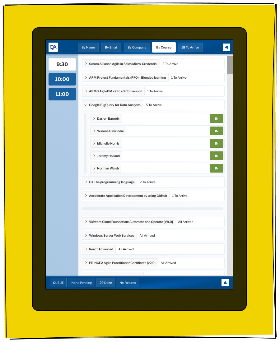
Clear and direct signage, combined with a straightforward interface, makes the QA Arrival experience easy to understand at a glance. Every label, icon, and navigation element guides users toward the next step without hesitation, reducing confusion and supporting confident decision-making.
Principle Four:
Low Friction, High Direction
There's an old saying in UX that “nothing should be more than two clicks away.” In over twenty years of testing, I've never seen that proven true. Users are happy to click multiple times - often more than a dozen - as long as each step is simple and clearly moves them closer to what they want.
People don't dislike steps; they dislike confusion.
An Example
The QA Sales Portal embraces the reality that people don't mind taking multiple steps - as long as each one feels purposeful and clearly moves them closer to their goal. Instead of overwhelming people with every possible option on a single screen, the portal guides them through a sequence of highly focused actions.
By prioritising clarity and direction over arbitrary limits on the number of steps, the QA Sales Portal creates a smooth, confident experience that keeps people moving forward.
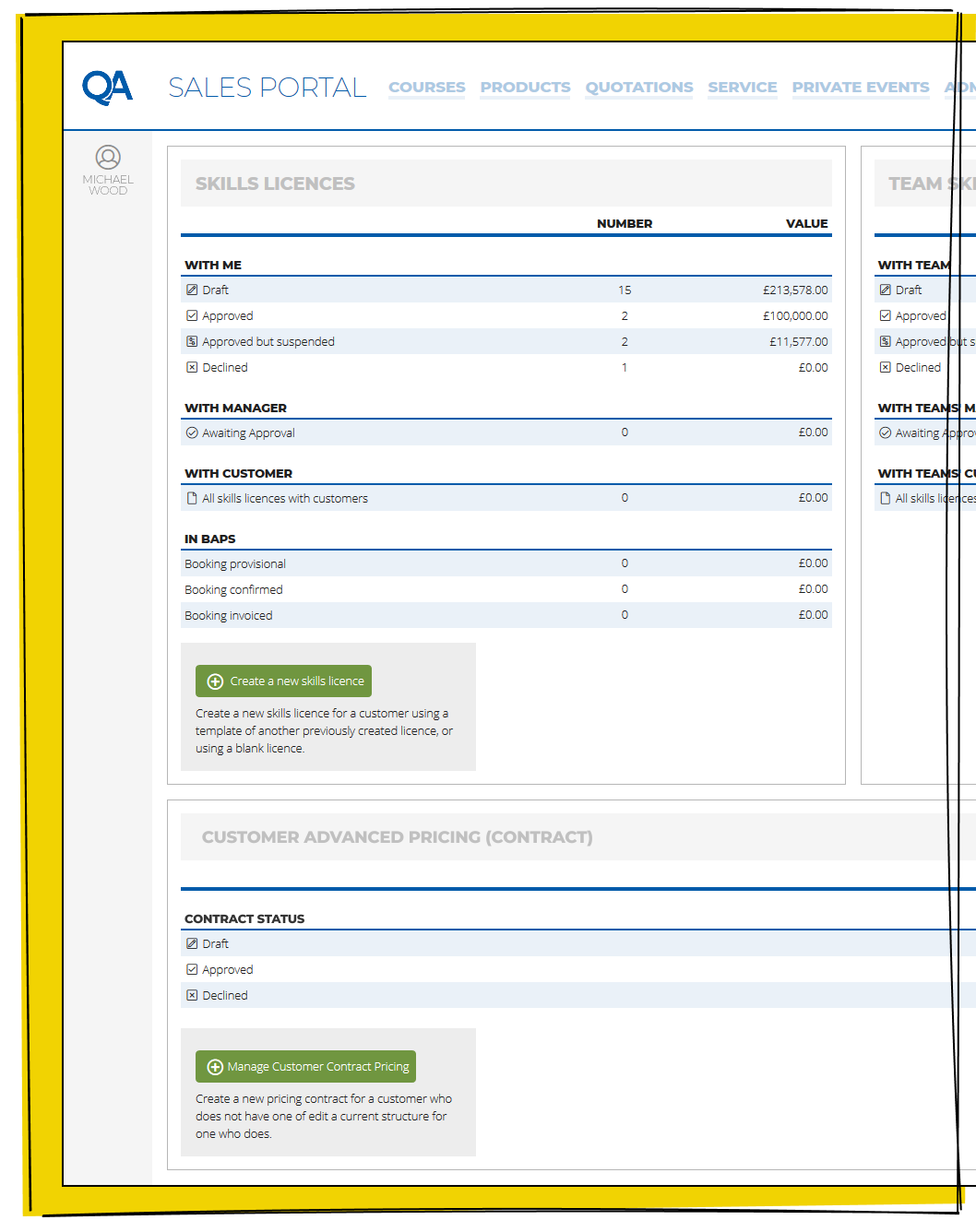
Low Friction, High Direction on the QA Sales Portal ensures that every interaction feels effortless and purposeful, guiding users step-by-step without overwhelming them with unnecessary choices. By presenting clear pathways and meaningful actions, the portal keeps momentum high and users confidently moving toward their goals.
Summary
Most interfaces end up showing more information than they should, usually for good reasons. New features get added, and nothing gets removed. Someone wants a piece of information promoted, but no one asks what could be deprioritised. Over time, information density increases, and clarity disappears.
By establishing and sticking to clear design principles, I've helped create interfaces that are easier to use, faster to navigate, and more enjoyable for people. Some have made jobs simpler, some have sped up workflows, and others have simply presented information in a more human way.
