Portfolio
The Arrivals Project for QA

The Arrivals Interface was tested at Wireframe, Prototype and Design form, two of which are shown here. Given the scope of the project, and how picking up a second of speed would achieve our aims, the visual hierarchy changed as a result of that testing. Here we see the importance of the index on the left-hand side, and the underlining of the searched for term on the right.
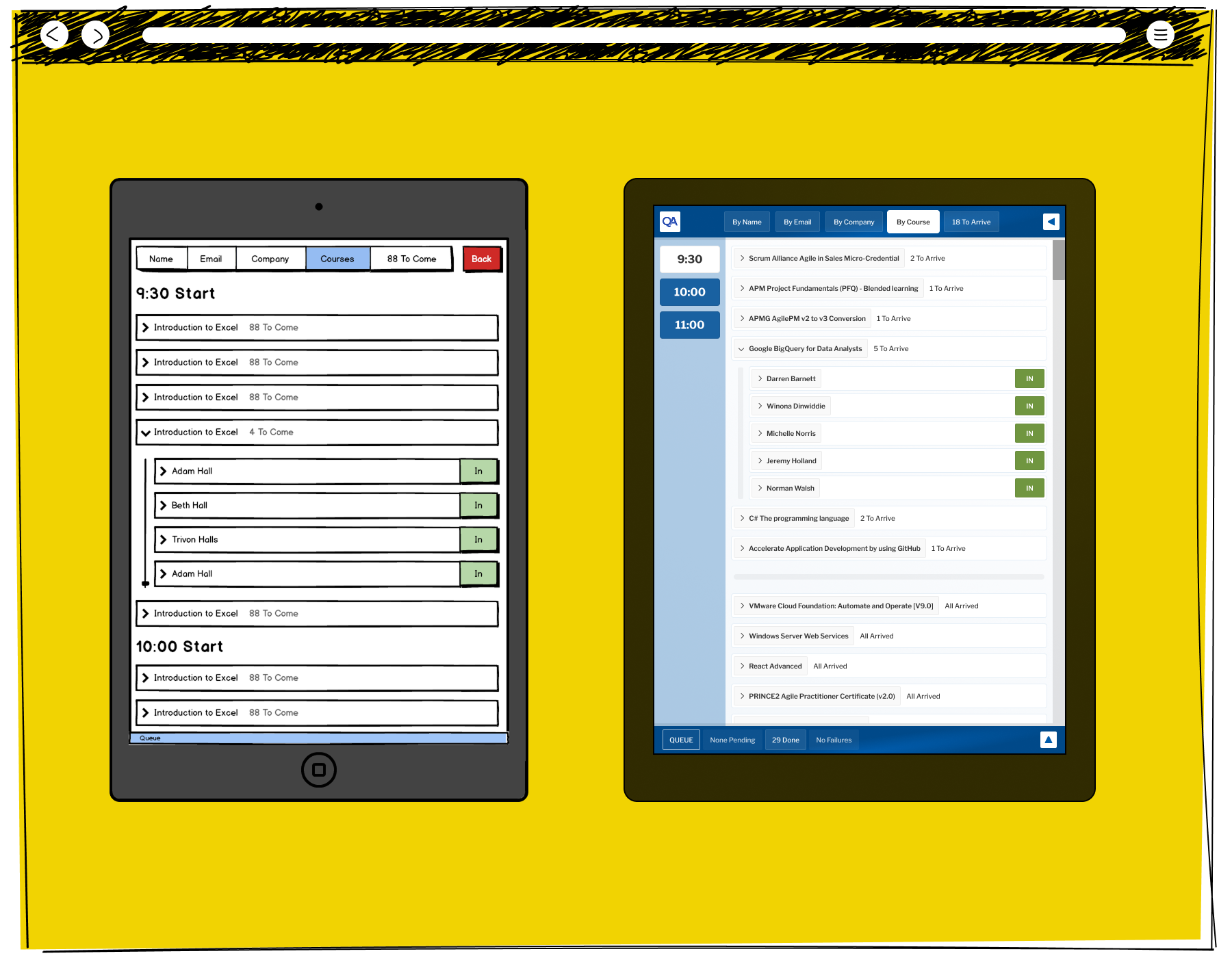
There was a subtle way in which the interface would drop away much of the colouring, showing the impact of the green calls to action while maintaining a structure on the page. This illustrates a situation where a group from a specific course has arrived, and they can be checked off in a group.
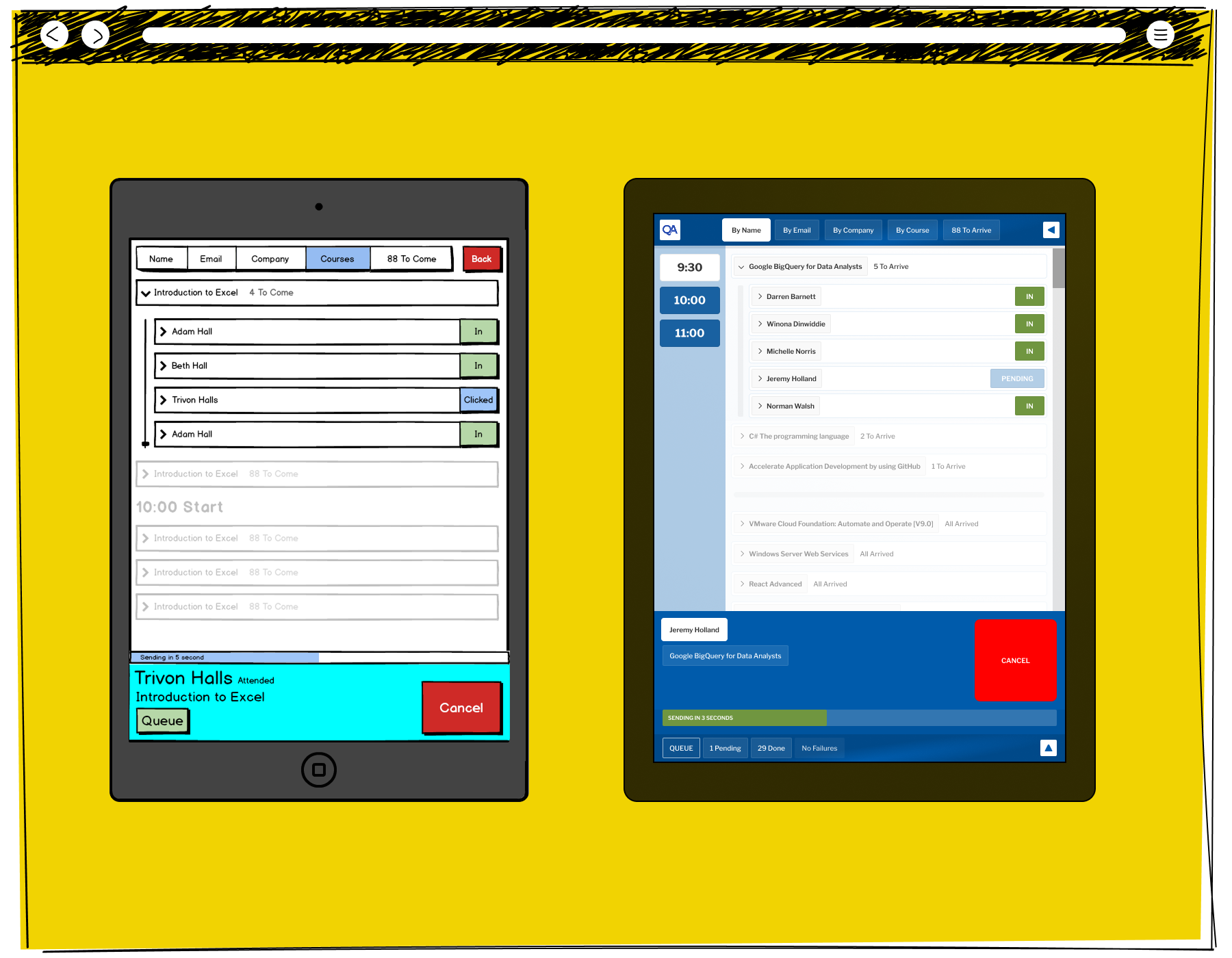
The Arrival interface buffered negotiations with the back end in order to stop the front end freezing until a positive return is made. Typically, Colleagues would click to sign someone in, and then talk to another person. This illustrates the interface when a mistake has been made in sign in, and the huge Cancel button shows how to stop the action from going to the buffering queue.
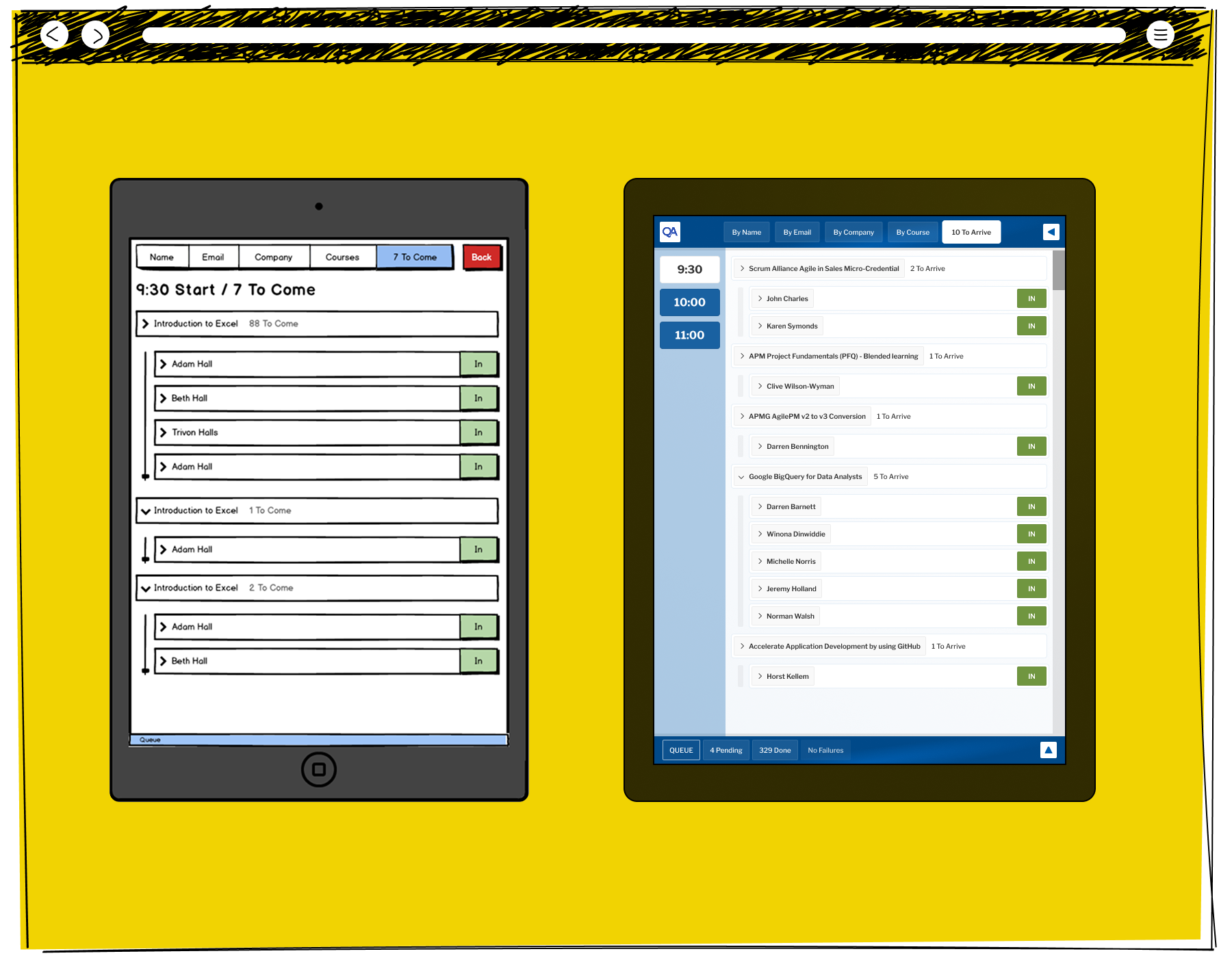
Towards the end of the sign in process, the Interface can adapt to only showing the Delegates who have yet to arrive, speeding up the process for people who are arriving late. This illustrates a screen when there are only ten people to arrive, and all are easily found.
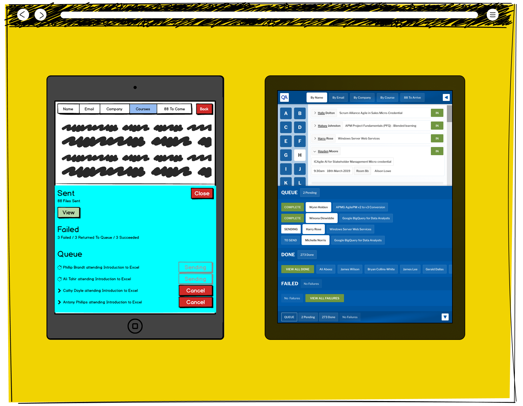
Colleagues found the system more useful, but there was a need to be able to take an overview of what was being processed, and any mistakes which have been made. This illustrates the short view a Colleague can use to review recent interactions between the front and back ends.
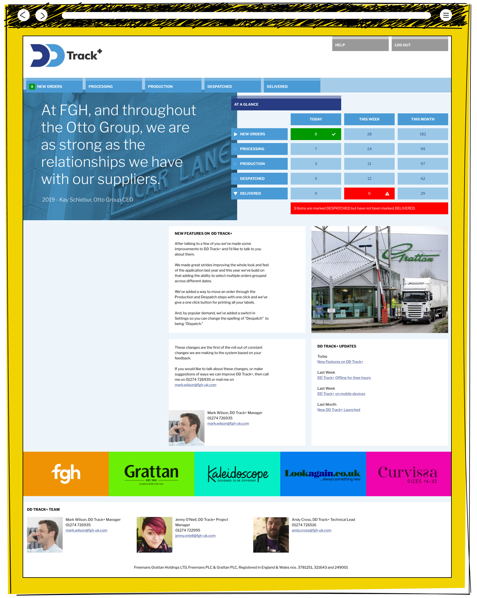
DD Track + for FGH

The initial view welcomes 3rd Party Users, while allowing them shortcut transactions having viewed those transactions in a depth of detail. The most popular setting in DD Track + was to allow our users to change the spelling of "Despatch" to "Dispatch".
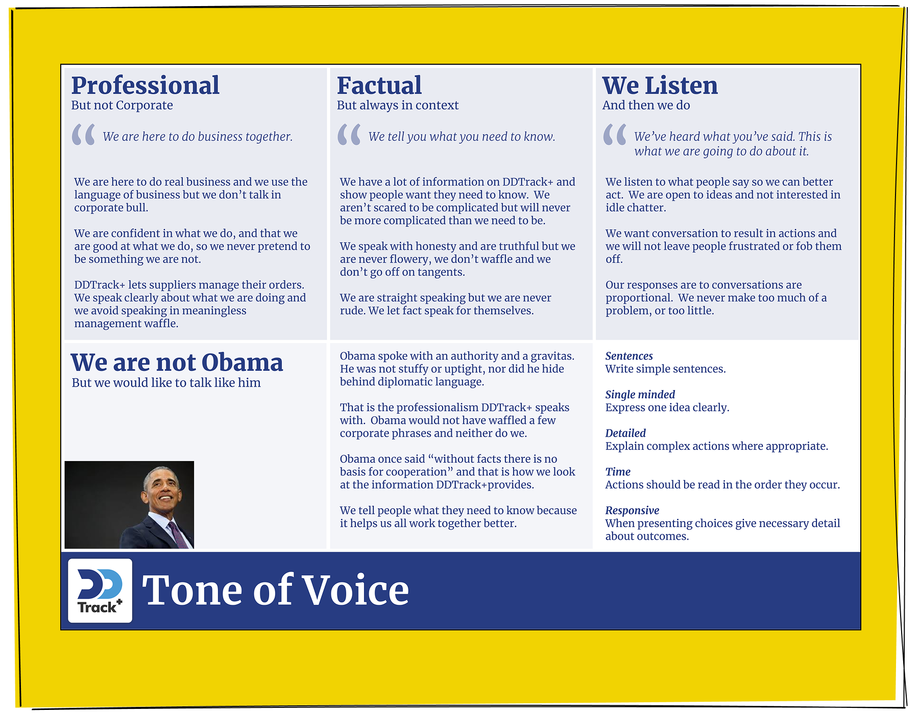
The Tone of Voice document for the project, which was part of setting a style for the project team, empowering our developers to create microcontent.
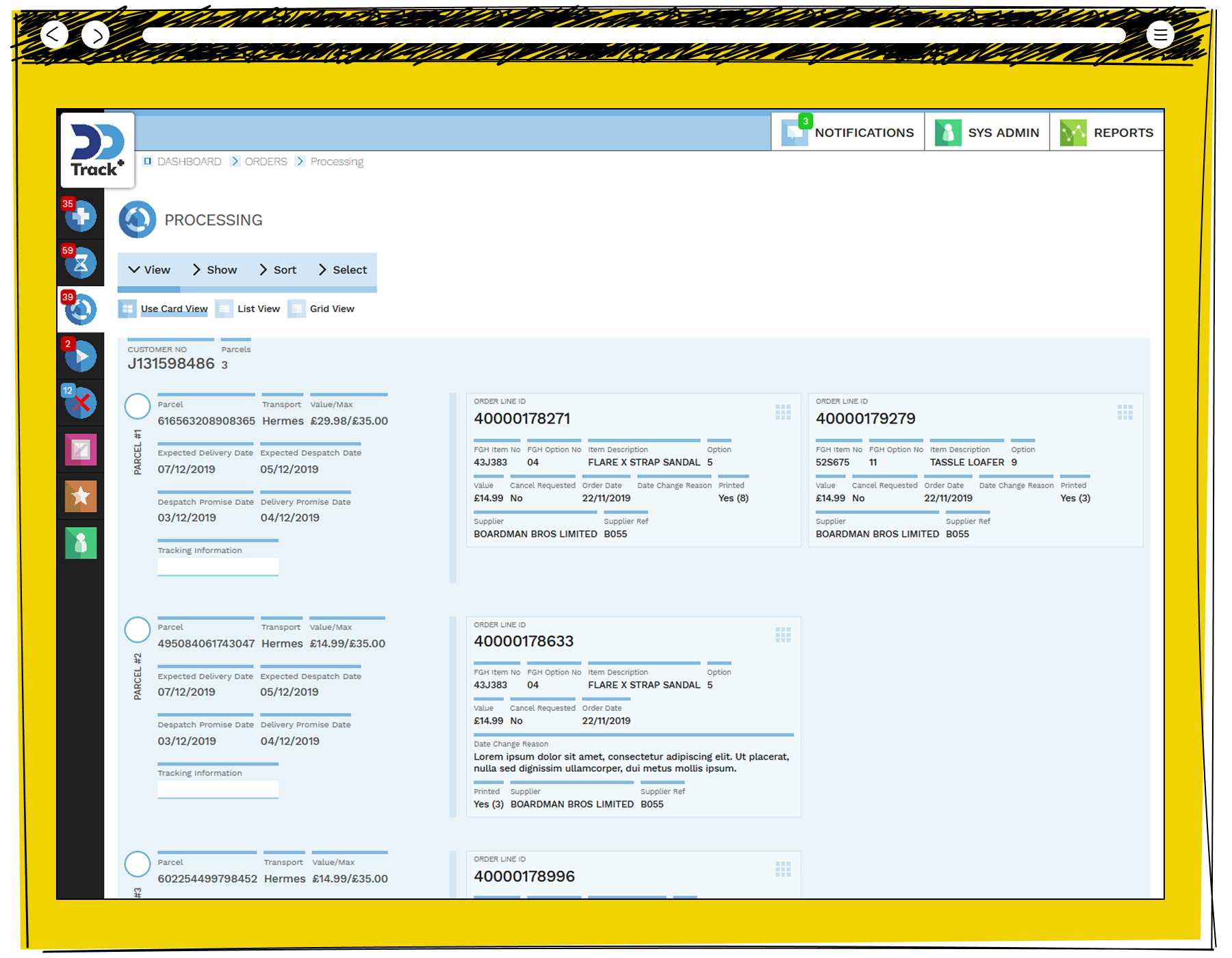
The Card interface, showing the system's ability to handle multiple interactions within a single transaction. This allowed us to speed up the number of transactions a 3rd Party User could enact.
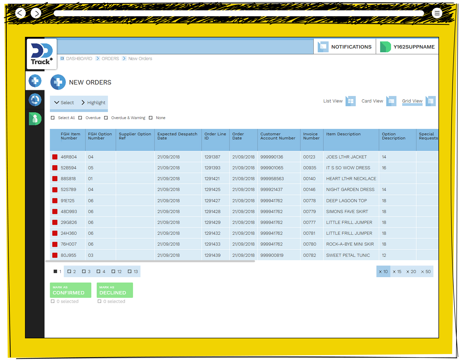
The View allowed high volume customers to transaction many Orders quickly. This illustrates a way those 3rd Parties could filter, sort and compare those transactions and group process them.
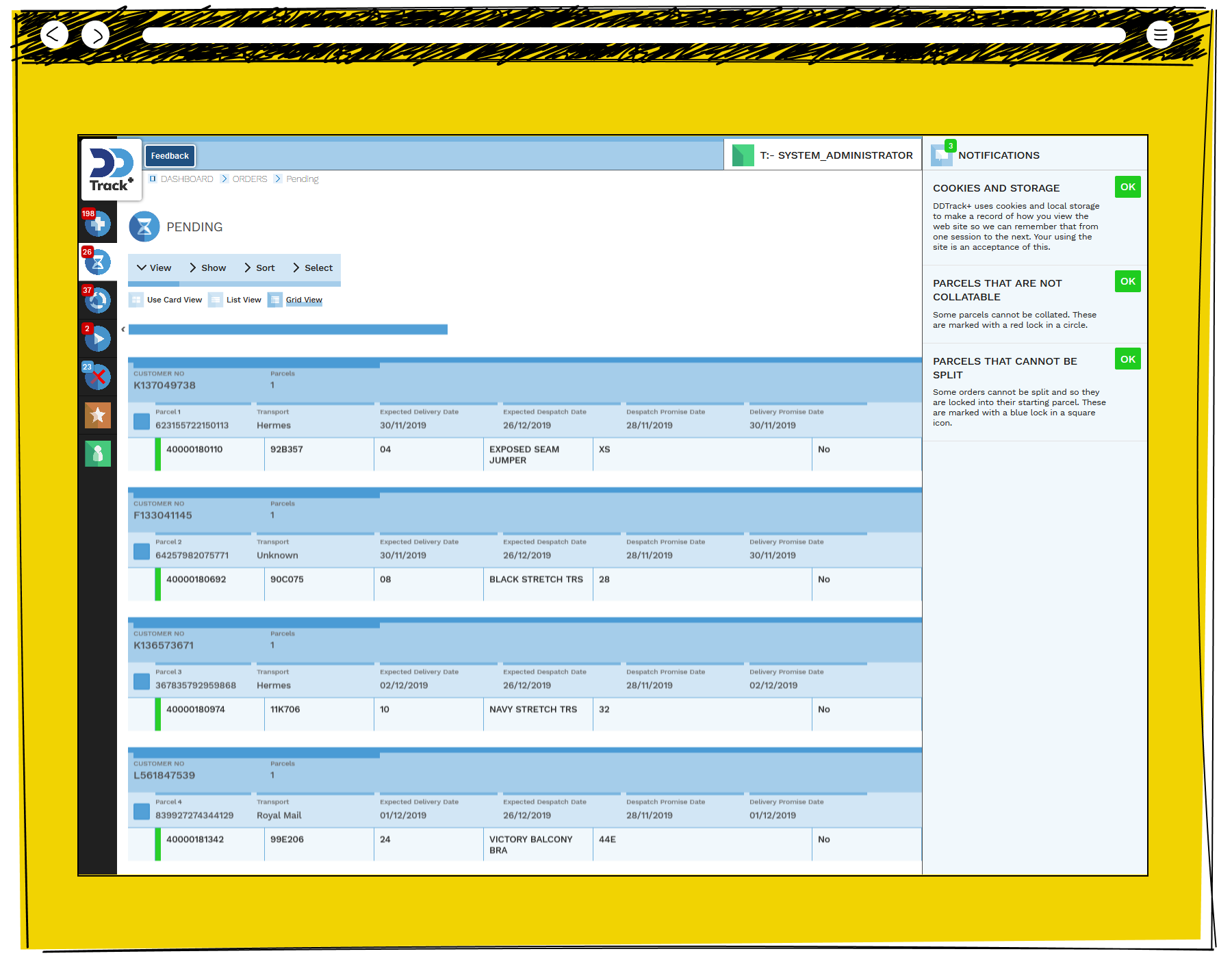
The interface allowed users to customise their views, reflecting the differences between the 3rd Party customers and the volume of transactions they conducted. This illustrates the Grid View.
Sales Calculator for QA

The opening view of the QA Sales Portal reflects the application state as an every day working tool. It presents information quickly, and gives the Salespeople what the need to know the moment they start work.
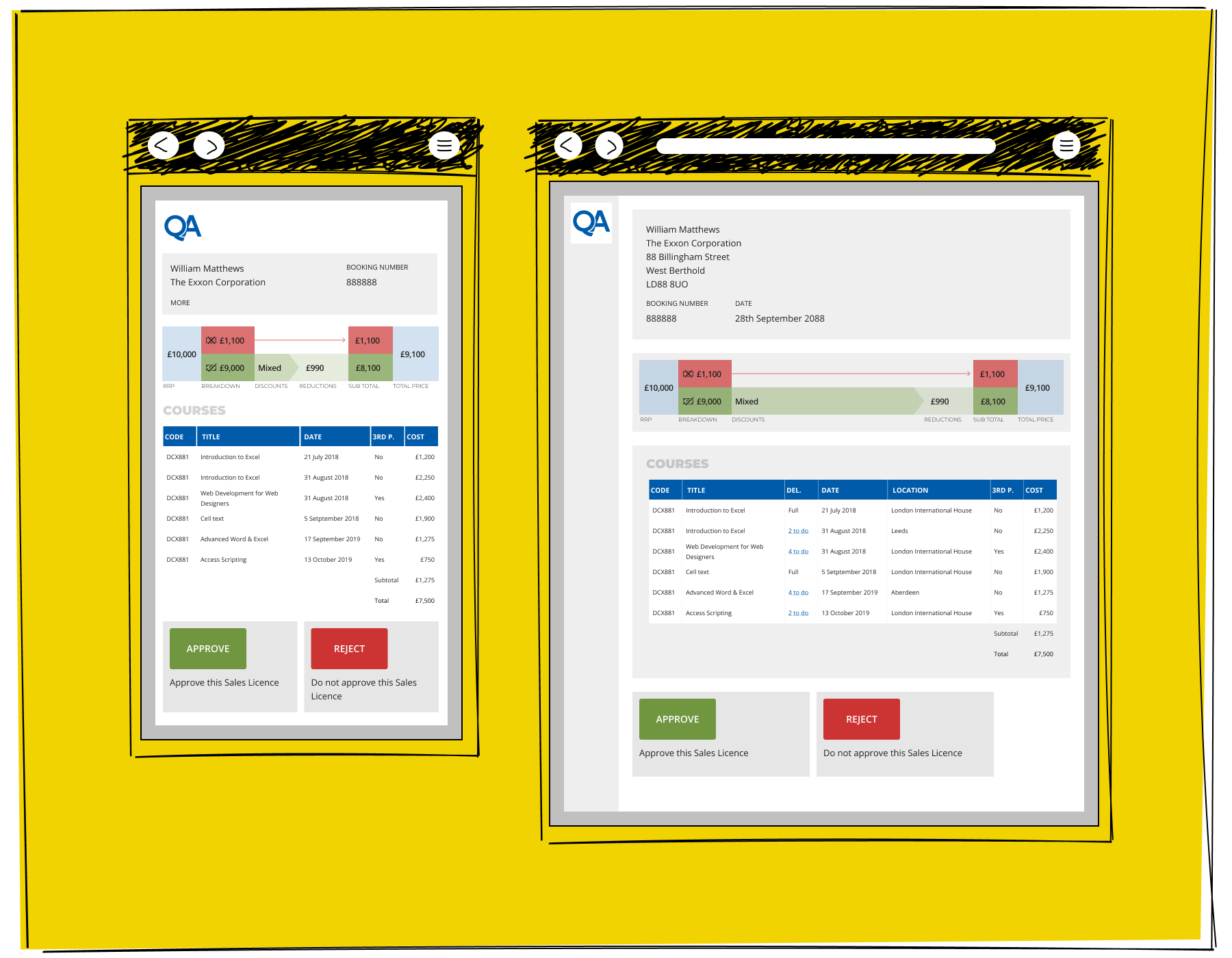
Higher level approvals needed to be presented to Management with important information clearly presented for rapid judgement.
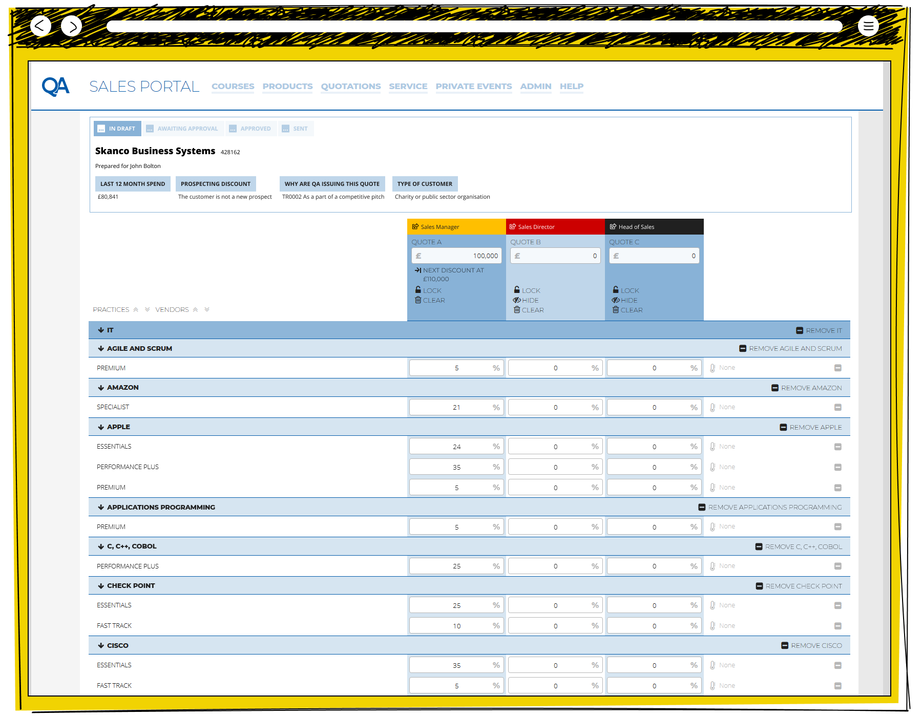
The Calculation page presents the base functionality of Excel, with bespoke tricks to maximise the usefulness of the tool. This view illustrates the Salespeople's desire to have three comparison quotes, and an understanding of the levels which they will need to be signed off at.
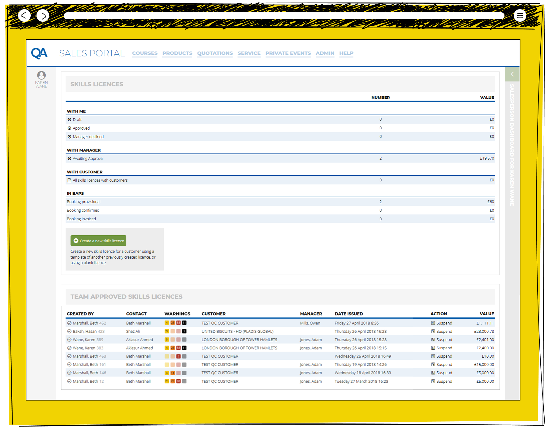
The Management view of the opening page of the QA Sales Portal. The Team Approved Sales Licences illustrates the sign off levels which are currently active.
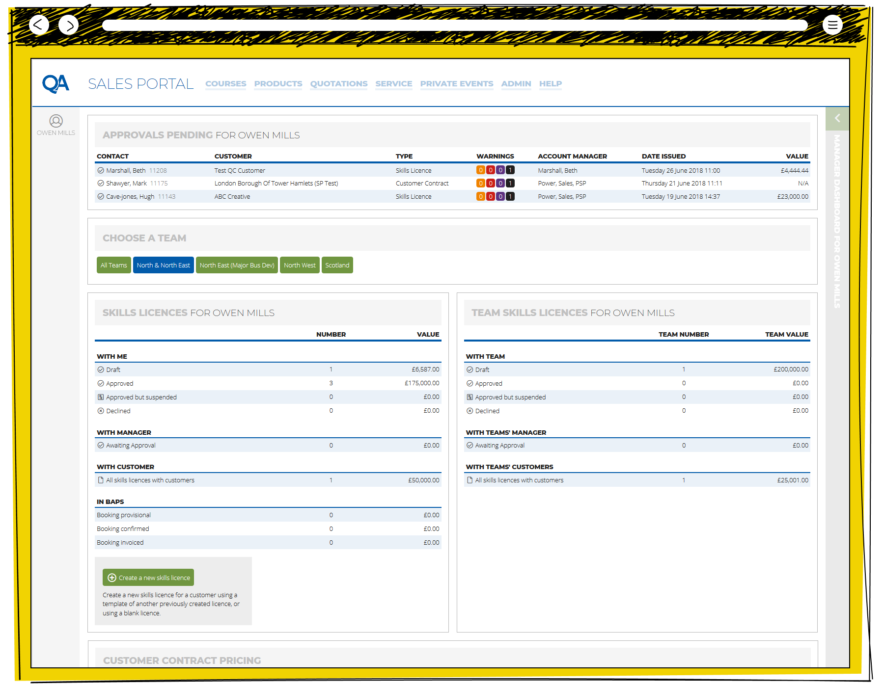
The Sale Team Leader view of the opening page of the QA Sales Portal allowing a view across any number of Regions, and pending approvals.
Portal for Lexxic

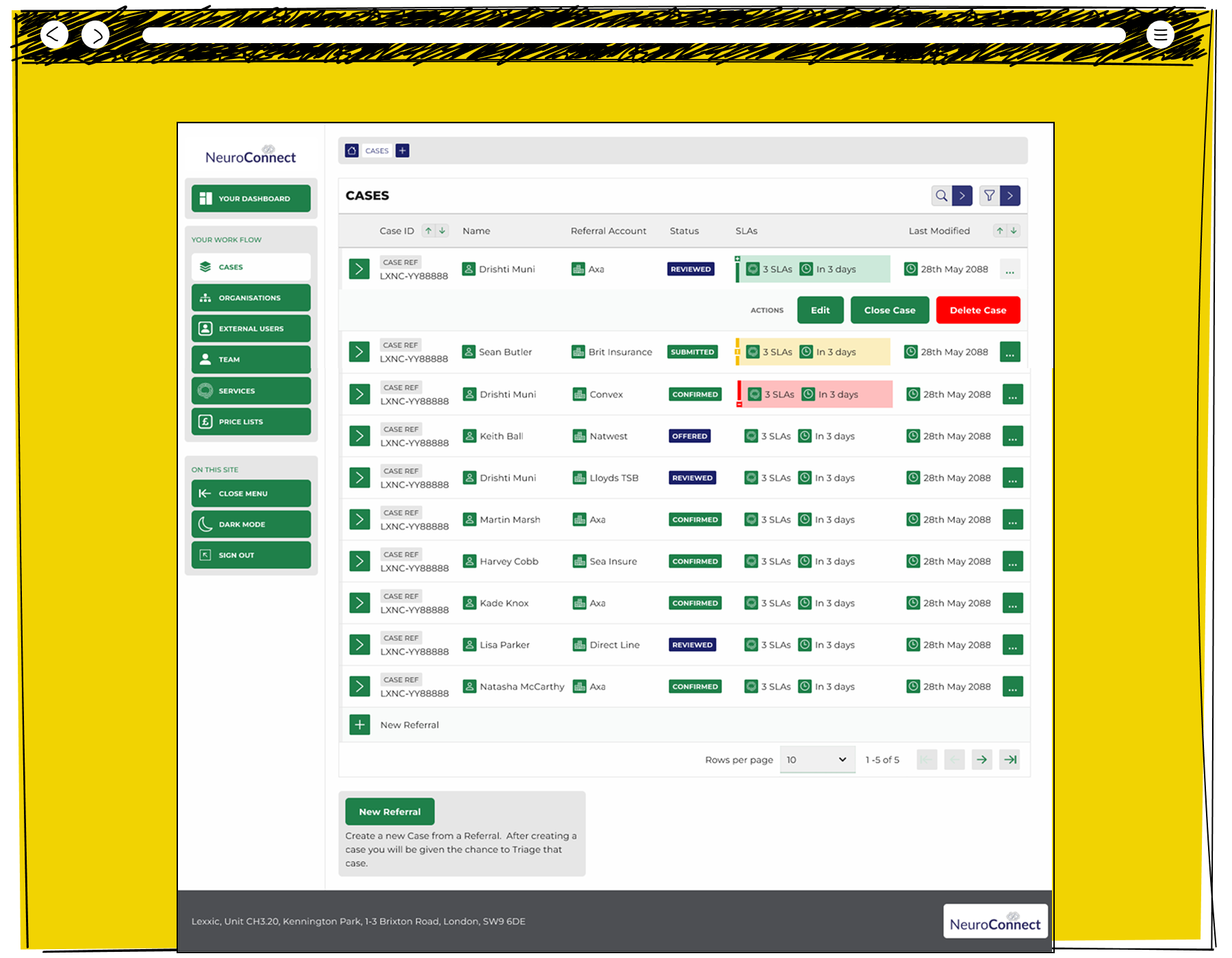
The overview of a Case Referrals on Neuroconnect, highlighting Service Level Agreements and different tolerances between different organisations.
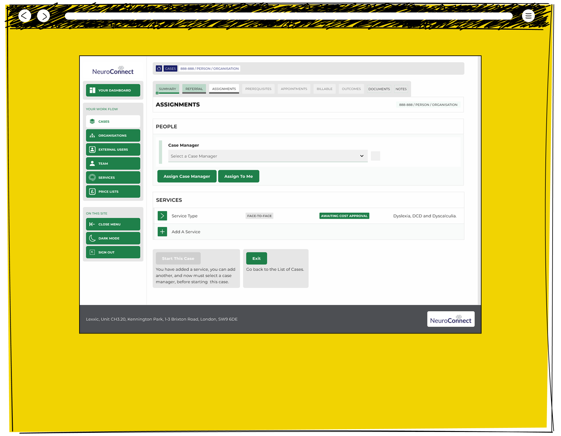
The Neuroconnect interface allowed Administrators to transact within a single screen.
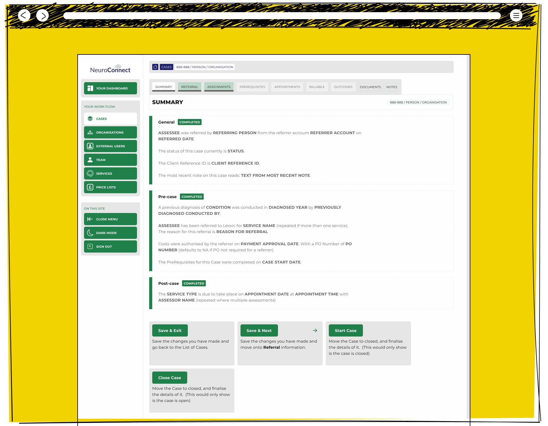
Neuroconnect created summaries of the information with in the system. Later, I would be told, that this page was rebranded as an "AI Summary", which is interesting, given that I am the person who wrote the code which powered it.
The details pages of Neuroconnect were a bespoke creation in negation with the wider team, allowing them to get into rich detail where they needed it.
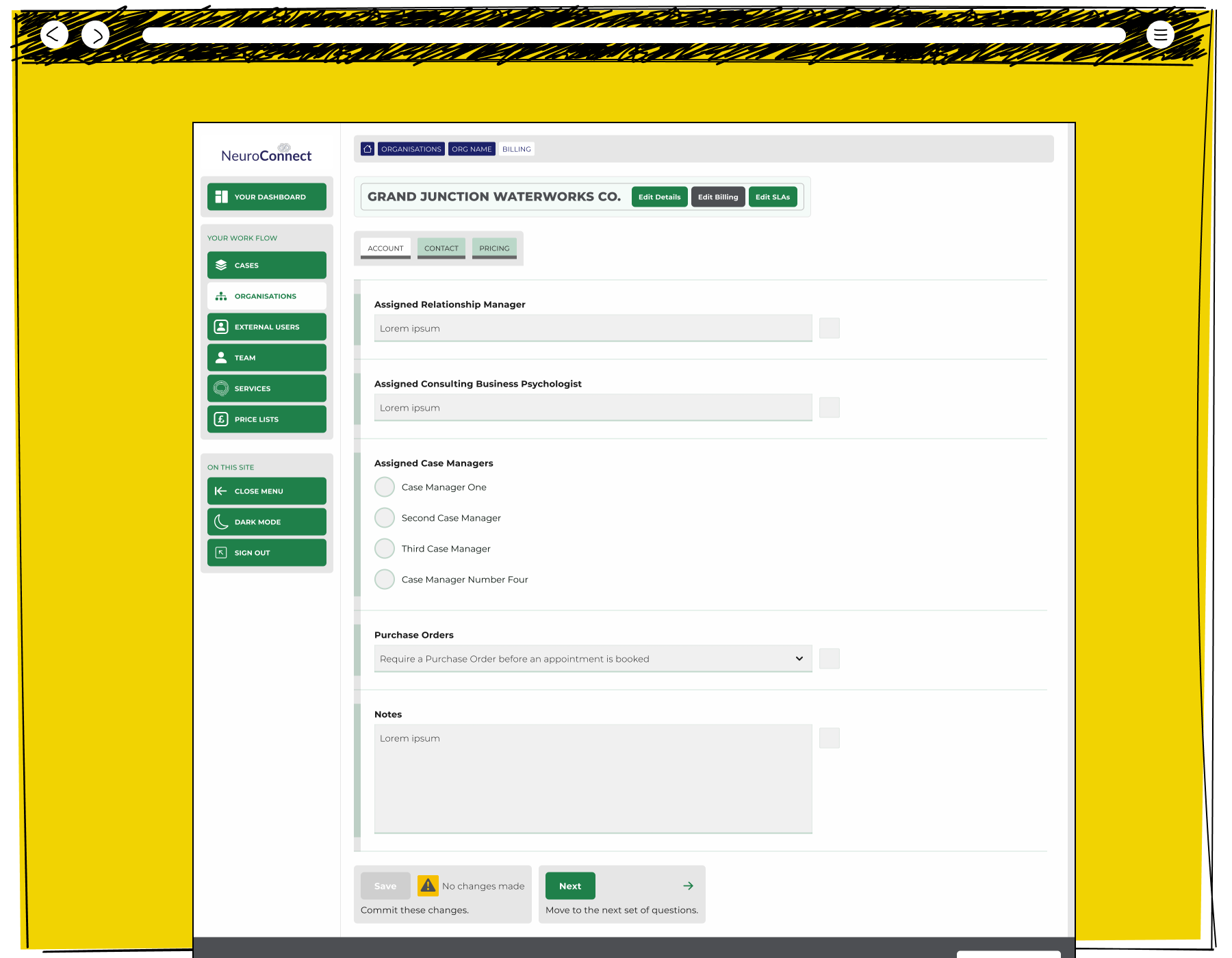
When an Administrator needed full detail, the interface needed to add layers of complexity while retaining a clear look.
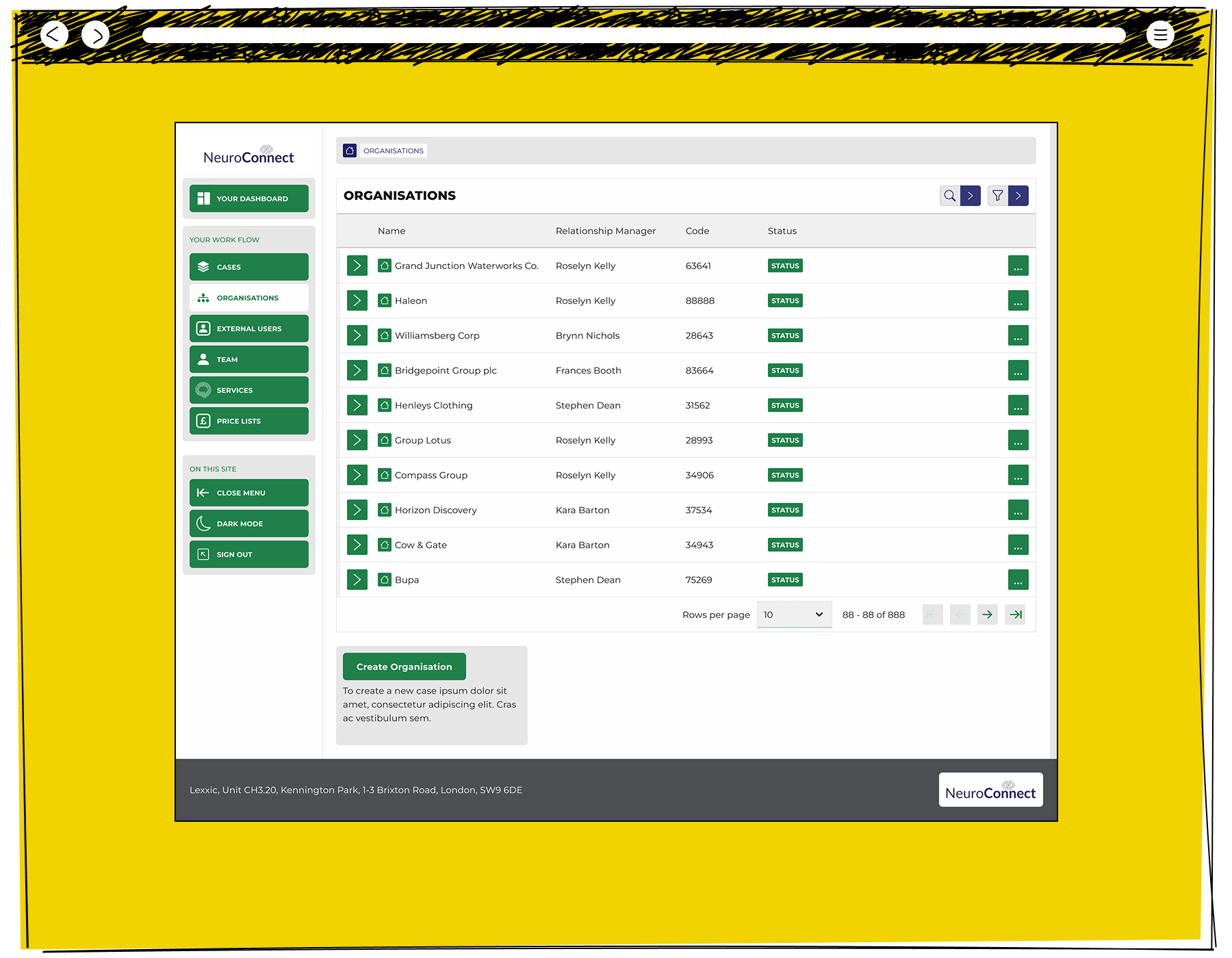
The interface centred around transacting Cases, but it also needed to be flexible enough to naturally present broader information.
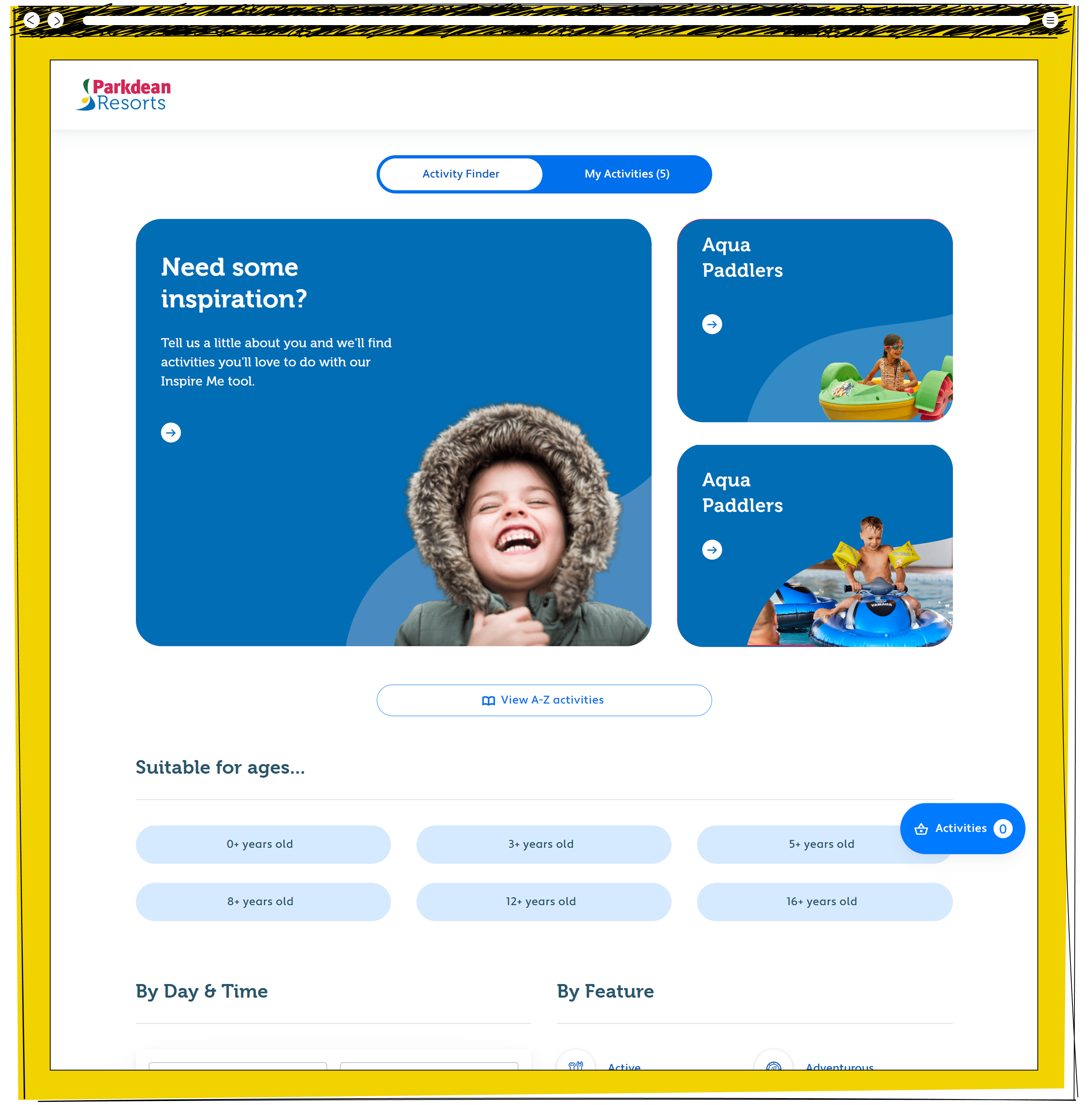
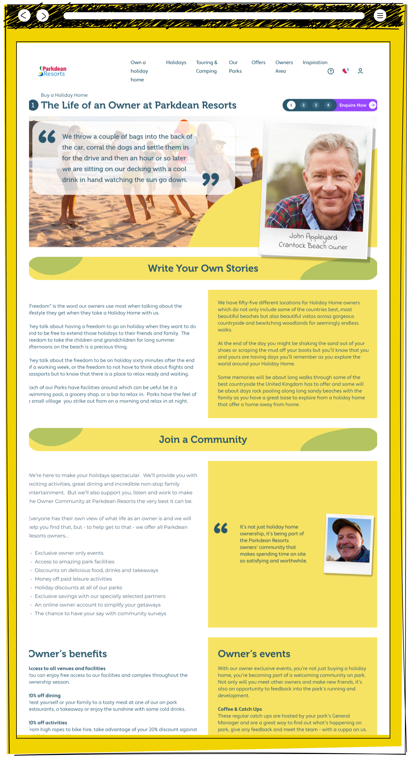
Holiday Home Sales for Parkdean Resorts

The opening page of the raw design of the Parkdean Holiday Home Sales section.
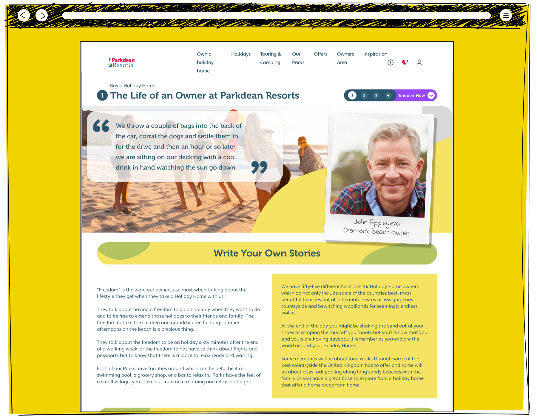
The "Write Your Own Stories" pages of the Life as an Owner at Parkdean Resorts.